Power BI vs Tableau vs Data Studio (Looker Studio): Overview and Comparison of Tools

Power BI, Tableau, and Data Studio (Looker Studio) are the three most popular tools… and here I face a dilemma of wording. If I say “visualization tools,” I immediately downplay the capabilities of Power BI and Tableau. If I say “business intelligence systems,” then Data Studio (Looker Studio) seems a bit “inflated.” So let’s settle on this: today, we’ll look at three tools that can help you make your data understandable.
We’ll go over their features, strengths and weaknesses, pricing, and use cases to help you decide which one is best suited for your business.
Here’s the plan:
Disclaimers
We’ll be talking not about Looker, but about Data Studio (Looker Studio), since its popularity compared to its “older brother” is undeniable.
Also, in this article, you’ll find not only objective details but also some of my own subjective opinions based on experience. That said, I’ll try to explain everything in a way that helps you navigate between the systems depending on your specific task—because in analytics, so much really does depend on that task.
Strengths
Advantages of Power BI: over 250 connectors, flexible modeling, and a free starting plan
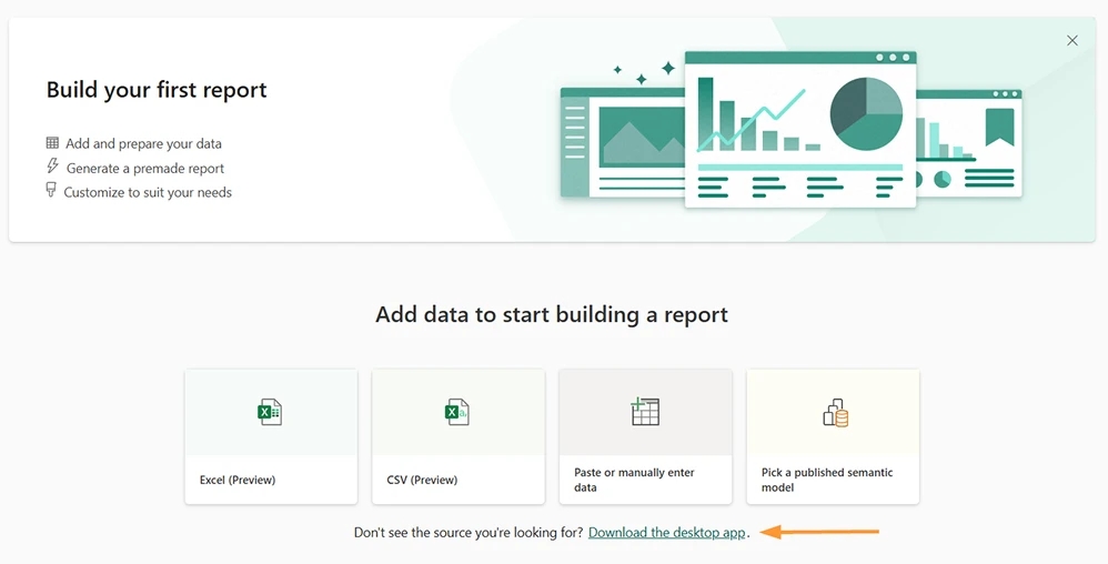
If you take a closer look at how each of the three tools greets new users, you can quickly form a fairly clear picture of their strongest sides. For example, Power BI immediately encourages you to install the desktop app if your data is anything more complex than just Excel or CSV.
Once installed, this is what you see:
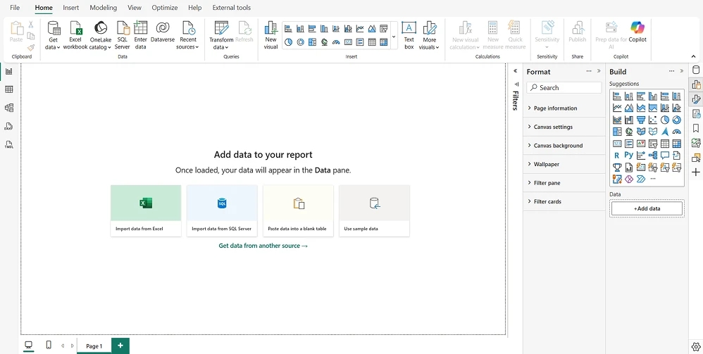
Back in 2021, when I first saw the initial screen, I’ll be honest—I was overwhelmed by the sheer number of icons and postponed getting to know the tool until “better times.” And, in fact, my first impression was spot-on: Power BI has countless features hidden behind all those icons and menu items, but it does take time to learn—especially if you’re not already comfortable with Excel.
Eventually, those “better times” did come, and I can say without hesitation that investing the effort into learning Power BI was more than worth it. Here are some of its strongest sides:
- Data modeling – among the three tools, Power BI handles complex data models the best. With the right structure, it can easily manage dozens of tables from different sources.
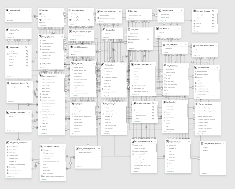
- 250+ data source connectors – as hinted above, Power BI offers a wide range of native connectors. You can find the full list here (see the Power BI (Semantic models) column). Thanks to this, Power BI can serve as the central hub for all of a company’s analytics.
- Custom business logic with DAX – Power BI has its own formula language called DAX. If you know Excel, DAX will feel somewhat familiar, but it goes much further. With DAX, you can build calculations of any complexity to cover even highly specific business needs. The only real limit is the user’s skill.
- Visual calculations – a feature that allows you to write formulas directly on a specific visualization. It’s similar to calculated fields in Tableau. This makes Power BI a bit easier for beginners, although such calculations are tied to a given visual and don’t interact with the broader data model.
- Free plan and the best price-to-features ratio – you can use Power BI with all its core features for free. The main limitations: reports can’t be larger than 1 GB, and you can’t share them with other users via their accounts. Still, for small and even mid-sized projects, sharing via a single login/password is often good enough. To share reports properly, you’ll need the Pro plan ($14/user/month). If a report exceeds 1 GB, you can switch to Premium per User for just $24/month, hosting up to 100 GB per report and a total capacity of up to 100 TB. Yes, terabytes. Put simply, for the price of a daily cup of coffee, you can create 100 reports of 100 GB each. More on pricing later, but already this is the lowest cost for such capabilities.
- Flexible data storage – Power BI can store data internally, reducing queries to databases and lowering processing costs. Often it’s enough to refresh data once a day, while still taking full advantage of interactive reports. For those needing real-time data, Power BI offers DirectQuery, which fetches the latest data from the database whenever visuals are updated.
- Power Query – the built-in tool for connecting, importing, cleaning, and transforming data. In short, it’s the “kitchen” where raw data gets prepped before being sent to the model, enabling complex ETL processes (Extract, Transform, Load) without coding.
- Forecasting and analytics out of the box – Power BI can generate forecasts directly in line charts based on historical data, specifying forecast length and confidence intervals, as well as trend lines, averages, medians, constants, and min/max values.
- Incremental refresh – a feature that allows you to load and archive historical data once, and then refresh only recent periods (e.g., the last week or month). This reduces database query costs while keeping the full data history available for analysis.
- Custom visuals – if the built-in visualizations aren’t enough, Power BI has a marketplace of community-created visuals. Many are free, and you can even build your own using R or Python.
The drawbacks of Power BI are covered later in the article.
Advantages of Tableau: Drag-and-Drop Exploration and Interactive Visualizations
The Tableau interface greets us with a slightly smaller number of buttons. And what’s notable — it greets us with space for a single visual. Unlike Power BI with its tabula rasa canvas for a future dashboard, most of the first screen in Tableau is occupied by a large rectangle labeled Sheet 1, and above it — fields for measures and dimensions in columns and rows. To see visualization options on the right, you need to additionally click the “Show me” button. But since this button isn’t very obvious, Tableau subtly suggests that you might not need it — at least not in the beginning. And indeed, once you load your data, you can immediately start dragging and dropping dimensions and measures, and Tableau will attempt to select the best visualization for them. This behavior reflects the primary purpose of this tool — fast, exploratory data analysis.
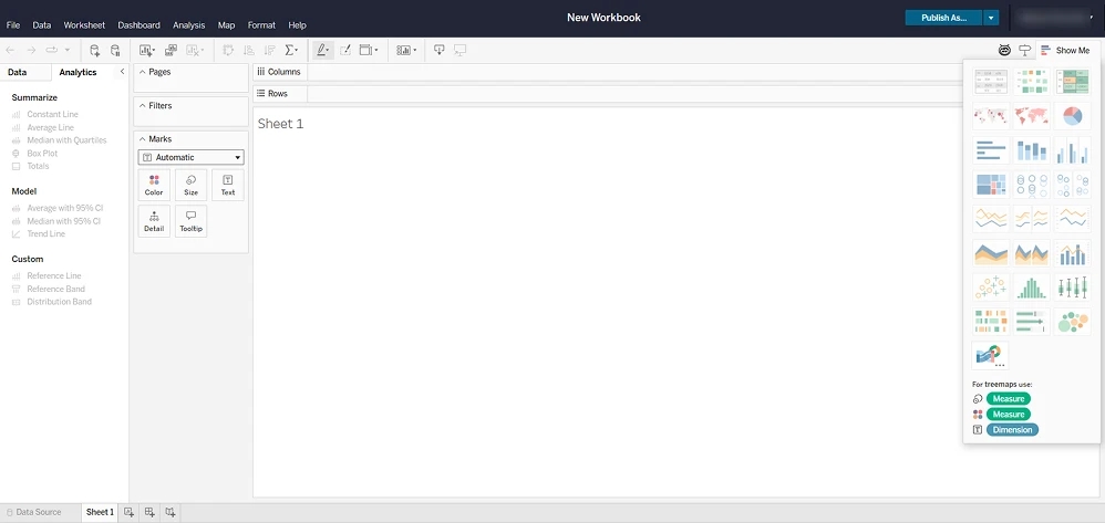
Among Tableau’s strongest sides, I’d highlight the following:
- Drag-and-drop EDA (exploratory data analysis) — as mentioned above, the main canvas allows you to quickly build visuals simply by dragging fields, letting you explore data on the fly.
- A wide set of built-in statistical and analytical functions — this speeds up analysis since many popular statistical formulas can be applied in just a few clicks, from trend lines and forecasting to clustering and statistical calculations.
- About a hundred data source connectors — Tableau also offers a wide range of systems it can connect to. Full list is available here.
- Flexible data storage — Tableau can store data locally in Extracts and refresh them on a schedule, allowing you to avoid queries at every visualization update. At the same time, if you need real-time access, the Live connection mode is also available by default.
- Relatively simple and detailed documentation — the tool itself is not trivial, but it’s somewhat easier to learn on your own compared to Power BI, thanks to well-structured documentation that is detailed yet not overwhelming.
- More interactive reports — in my opinion, Tableau’s key strength lies in building highly interactive visualizations. Almost everything can be clicked, filtered, or changed directly within the visualization, without diving deep into the tool. It’s easy to set up tooltips that display additional visuals or adapt their content dynamically. This allows for layered reporting, where a single chart can tell multiple stories: on its own, and upon hovering with cross-filtering interactions.
- Simpler interaction with geodata — Tableau’s mapping capabilities are, for me, a separate highlight. Geographic and logistics data can be represented in a very clear and interactive way.
- Easier calculation writing — unlike Power BI, which separates calculated columns and measures, Tableau uses a single type of calculation, very similar to SQL. For more complex formulas, however, you’ll still need to dive into the details of LOD (level of detail) calculations. While this simplification makes things easier, it also imposes limits: highly customized or overly complex formulas may not be feasible.
Tableau’s drawbacks are listed later in the article.
Advantages of Data Studio (Looker Studio): Simplicity and Free Access
The first impression of Data Studio (Looker Studio) is: “looks like I can handle this.” After adding data, it immediately suggests dragging dimensions and metrics from the list to build your first visual.
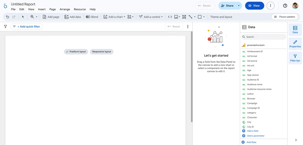
And by dragging just two fields, within a few clicks you already have a chart with a rather nice gradient:
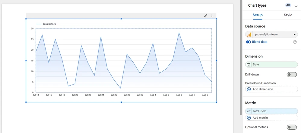
This simplicity and accessibility are exactly where Data Studio (Looker Studio) outshines its more “serious” peers — as if its creators first reached a state of zen and then built this tool.
Here are the strong sides of Data Studio (Looker Studio), point by point:
- Intuitive interface — a maximally simplified system for a quick start. Without extra knowledge, you can quickly build basic reports.
- Quick handling of simple tasks — as follows from the previous point. If you don’t need anything complex, this tool is more than enough to build a dashboard on your own and start making data-driven decisions.
- Accessible to everyone — literally: free of charge, runs in the browser, and you can share reports with colleagues via their emails.
- Nice default visuals — of course, “beauty and design” are subjective, but many find dashboards built in Data Studio to look more appealing than the standard visuals in Power BI or Tableau. With those two, you can build incredible reports in terms of design and usability, but it takes time. Not everyone is willing to invest effort into design when the priority is to quickly get clear data for decision-making.
- Simple documentation — with a tool this straightforward, it couldn’t be otherwise. You might not even need it, but it’s there just in case.
- Integration with Google services and popular databases — more than 20 native connectors, including Google services (GA4, Google Ads, BigQuery, etc.) as well as popular databases like PostgreSQL and MySQL. The full list is here. For an extra cost, you can use third-party connectors or even build your own.
The disadvantages of Data Studio (Looker Studio) are listed further in the article.
Weaknesses
Now let’s talk about the limitations and potential challenges you may encounter when working with each of these three tools.
Power BI Limitations
- Need to understand DAX and filter context – there’s a reason why DAX is so powerful. It has built-in capabilities that you must know how to control, and to do that, you need to understand them. DAX itself is essentially queries to the data model, which operate in the context of a specific visual. Even this sentence may have sounded difficult to grasp.
Anyone working with Power BI needs to develop a spatial understanding of all the relationships in the data model and how formulas interact with them at the level of each visual. This is not easy, but it can be significantly simplified, for example, with the PRO ANALYTICS course, which is well-suited for beginners, and with the books and courses from SQLBI for much deeper study of Power BI specifically. To quote SQLBI’s instructors: DAX is simple, but not easy. The language is highly logical, but from experience it is quite difficult to fully master the breadth of this logic.
- Need to know data modeling principles – especially “star” and “snowflake” schemas. As the number of tables grows, the likelihood of building an incorrect and slow model increases exponentially. And if the model only ends up slow, that’s manageable. The real danger is ambiguity and incorrect calculations. Detecting ambiguity and spotting calculation errors caused by wrong relationships is difficult, because these issues are often non-obvious.
Of course, Power BI tries to help: it will warn you that relationships may be slow or risky, and it will flag explicit model ambiguity. If the ambiguity is implicit, it will choose the most optimal calculation paths. Still, the correctness of the data model ultimately depends on the person building it. - Non-intuitive interface – this was what scared me during my first encounter. There is just so much in front of you, which is overwhelming — without prior knowledge you can easily get lost among the sheer number of available options. On the other hand, I honestly don’t know how else one could organize such a large amount of functionality.
- Complex documentation – the official documentation is overloaded with details and written in technical language. This can be a barrier to mastering the tool.
- Report sharing is only available on paid plans – this is Microsoft’s strategy. They give you an incredibly powerful tool for free, but a critical feature like sharing a report to another person’s email is only available with the Pro license at $14/month. If you don’t need to restrict access, you can just share your login and password. With Pro, however, you can share reports more securely, restricting access to specific data for users logging in under their own accounts.
- Large reports only in Premium – this tier costs $24/month. It makes sense: more functionality comes with a price tag. Once a single report exceeds 1 GB, or all reports combined exceed 10 GB, you’ll need Premium. Typically, only businesses larger than “small” hit these limits. For medium and large companies, $24 is a relatively small price for convenient data analysis.
- Desktop app is Windows-only – as we know, Power BI encourages you to install its desktop app for easier report building. But it’s Windows-only. macOS users need workarounds, which complicates things. While browser-based capabilities have grown significantly in recent years, they still aren’t sufficient for building moderately complex reports comfortably.
- Incremental refresh specifics – without understanding this concept, you can overload your database or increase processing costs. Incremental refresh can greatly reduce both refresh time and cost, but only if configured properly. If set up incorrectly, costs can instead skyrocket.
The advantages of Power BI were discussed earlier in the article.
Tableau Limitations
Among Tableau’s drawbacks, I would highlight the following:
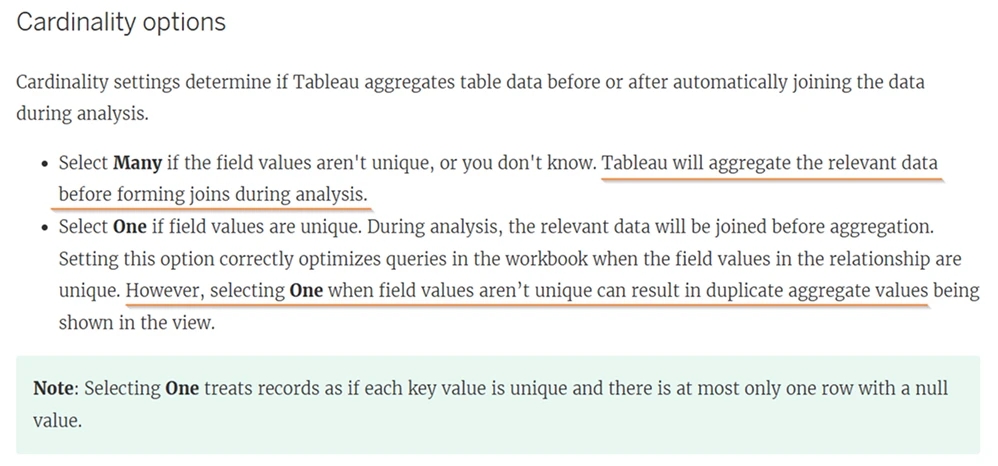
- “Many-to-many” relationships by default – when combining tables, Tableau creates this type of relationship by default, giving itself “fallback routes.”
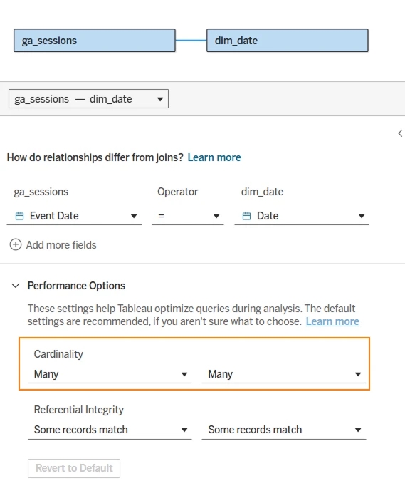
A many-to-many relationship tells Tableau that the join columns in both tables may contain non-unique values.
For example, when joining the ga_sessions table with the dim_date calendar, Tableau assumes that both Event Date (in sessions) and Date (in the calendar) may contain duplicates. Under such conditions, Tableau first aggregates the data and only then joins it. Personally, I don’t fully trust this hidden aggregation.
If you define the relationship as “one-to-many,” which is more classical and more optimized for performance, the process works in reverse: the data is joined first, then aggregated. In this case, Tableau shifts the responsibility for uniqueness checks entirely onto you — unlike Power BI, which can detect the join type and warn you if it’s suboptimal (“many-to-many”). Tableau simply mentions in the docs that if values are not unique, you may get duplicated calculations, meaning your numbers will be wrong.
- Data modeling – although Tableau has concepts like relations, joins, blends, and logical/physical layers, its modeling capabilities are far weaker than Power BI. In my opinion, these features mostly complicate the process without adding much formality or clarity. With many tables, it’s harder to understand their interrelationships.
Power BI makes this easier by focusing on more classical “one-to-many” joins and by clearly showing how tables influence each other. Another indicator of Tableau’s weaker modeling capabilities is that support for more than one fact table only arrived in version 2024.2 (released in June 2024). Personally, I find it hard to imagine building any reasonably interesting report with only one fact table. For example, you can’t build end-to-end analytics without combining data from multiple sources, which requires multiple fact tables. This update was therefore a major step forward for Tableau. - The most expensive tool in our comparison – you’ll need at least one Creator license to build reports, which costs $75/month billed annually ($900 upfront). You can share the login with your whole team, but if you want others to view the report under their own accounts, they need a Viewer subscription at $15/month.
- Weak Tableau Prep Builder – this tool, somewhat comparable to Power Query, is meant for data preparation. However, its functionality is very limited, so you’ll likely need to process your data at the source before connecting to Tableau.
- Complex calculations require knowledge of LOD and VizQL – while simple charts are quick to create, more advanced calculations require SQL, Tableau’s own VizQL, and an understanding of level of detail (LOD) calculations.
- More complicated dashboard building – Tableau starts you on a large sheet for a single visualization. To build a dashboard, you first need to create each component separately on individual sheets, then combine them later. This requires advance planning of the dashboard layout, otherwise it’s difficult to visualize the final report based only on individual sheets. This fragmentation makes it harder to maintain a spatial sense of the report’s structure.
- Non-intuitive interface – unlike Power BI, where most functionality is immediately visible, a significant portion of Tableau’s capabilities are hidden in menus (main and context). Without experience, you may not know where to click, drag, or right-click, or which tab to explore. Even relatively simple tasks (like complex table formatting or blending data from multiple sources) are implemented in non-obvious ways, requiring extra knowledge and time, which can slow down decision-making.
The advantages of Tableau were discussed earlier in the article.
Data Studio (Looker Studio) Limitations
- Various data handling restrictions – if you connect to BigQuery, each visual query must complete in less than 300 seconds. If you upload files (CSV, Excel), they must not exceed 100 MB. These restrictions are logical since all data is processed in your browser’s memory. At the same time, combining even a few relatively large files can make a report slow and unstable.
- API limits – Data Studio (Looker Studio) does not have a dedicated storage layer like the other two tools. Therefore, almost any filter change or cross-filtering action sends queries back to the data source via API. If you refresh a report often, you can quickly hit these limits. Additionally, if you have large datasets in GA4 and frequently encounter sampling (when the interface doesn’t return 100% of the data), you’ll face the same limitations in Looker Studio.
- Even with caching, queries = waiting – while the tool tries to cache query results, it still doesn’t have a full-fledged storage layer. If a subsequent interaction produces queries with results already in cache, LS will pull from there. But realistically, in analysis, we rarely want the exact same results. We need to segment data in different ways to identify trends and insights. With such behavior, LS sends fresh queries every time, fetching data directly from the source. If the dataset is large, you’ll end up paying for all those queries (though not to LS itself). Plus, each time you’ll have to wait for processing and retrieval.
- Data modeling — or rather, the lack of it – you can combine up to five data sources. At first glance, this might seem decent, but in practice, once you try to combine more than two sources, the tool often starts to “lag.”
- Need solid SQL skills to work with raw data – if simple formulas aren’t enough and you want to avoid joining data directly in Data Studio, most calculations and transformations must be done at the source. For example, if you’re using BigQuery, you need strong SQL knowledge. SQL allows you to produce the calculations you need and reduce dataset size, but usually this means your data will be pre-aggregated. As a result, reports lose interactivity and can’t respond to a wide range of filter combinations.
- Only conditionally free – you can use Data Studio for free only with Google connectors. If you want to connect other systems to pull data, in most cases you’ll need to pay third-party developers for their connectors.
- Bugs – when working with LS, you’ll often encounter small glitches that at best are annoying and at worst force you to redo some setups from scratch. For example, sometimes you need to configure the same connection multiple times before it successfully links to the data source. Troubleshooting is limited — the tool often doesn’t explain why data disappeared or why a chart isn’t updating.
The advantages of Data Studio (Looker Studio) were discussed earlier in the article.
What tasks is it best suited for
Power BI
It’s easier for me to say what it’s not suited for — because there are none. In skilled hands, this tool is almost omnipotent. Beginners may be discouraged by its complexity and find it unpredictable at first glance, but “under the hood” it has straightforward logic. It works well for complex reports, though when it comes to ease of getting started, it lags behind Data Studio (Looker Studio).
- End-to-end analytics and marketing dashboards – thanks to the large number of connectors, Power BI can connect to marketing data sources and combine them with a company’s internal data.
- Financial reporting – Power BI is often chosen for financial analysis due to its data modeling capabilities and DAX language, which resembles Excel and makes metric calculations easier for users with Excel experience.
- SaaS analytics – thanks to powerful data processing during calculations, it’s possible to build highly customized reports on minimally processed data, enabling maximum interactivity in calculations. This makes Power BI an excellent choice when you need to adapt to the specifics of business processes. One such example we described in the Reply case.
- Custom solutions – in Power BI, you can implement virtually any reporting logic. The flexibility of its data model and DAX makes this possible. You’re also not limited to standard visuals: if you know R or Python, you can create your own.
If you have a decent knowledge of Excel, you can build simple reports without deep expertise in the tool, while gradually investing time in learning its specifics. Over time, this will only benefit you — as your business grows and reports become more demanding, simpler tools may no longer cover complex needs. By starting your analytics journey with Power BI, you’re protected from hitting the tool’s limits. All your analytics will remain within one infrastructure, and for tasks you can’t handle yourself, your analytics team can always step in to help.
Tableau
The main task Tableau focuses on is fast data exploration. The process of building dashboards is somewhat more complex than in Power BI and Data Studio (Looker Studio). Here, you need to get used to the workflow and have a prior idea of the final picture. At the same time, Tableau offers the ability to create more interactive dashboards than the other two tools.
- Marketing reporting – Tableau can also combine data from different sources. Yes, its modeling capabilities are weaker, but it handles most marketing tasks perfectly well.
- Executive reporting – thanks to the ability to build highly interactive reports and the wide variety of visualization types available, Tableau is an excellent choice for users who frequently present their work results in reports. Tableau places strong emphasis on flexible customization of visualization design.
- Ad-hoc analysis and self-service analytics – Tableau lets you drop fields onto the canvas “on the fly” and immediately see what comes out, allowing analysts to quickly explore data and spot patterns. The tool was essentially created with the idea of “visual thinking,” so its drag-and-drop interface automatically suggests the optimal visualization type for the selected data.
Data Studio (Looker Studio)
This tool is mostly used for building targeted reports for relatively simple, specific purposes. It helps cover small tasks faster and more easily than the others. As soon as there is a need for larger datasets or more complex logic, other tools become necessary. This can lead to fragmented analytics.
- Reports for digital marketing teams – you could say this tool was created as an add-on to Google Analytics and Google Ads, enabling users to build reports based on that data. Marketing agencies widely use Data Studio for client reporting: it allows you to quickly assemble a dashboard with key website metrics (traffic, conversions, traffic sources) or campaign metrics (impressions, clicks, cost, CPA) and share a link with the client for viewing.
- Reporting for small businesses and startups with limited budgets – Data Studio is useful for those who don’t need to build complex analytics in Power BI or Tableau. If you just need to light a candle, there’s no reason to start a bonfire. You can still extract basic insights from sales or operations data with this tool. For example, a small online store can connect Google Sheets with order data and build a sales dashboard by product, country, and more. Or a SaaS startup can connect directly to Google BigQuery, where their product data is stored, and create a user activity dashboard.
- Simple dashboards without deep analytics – this tool provides all the basic types of visualizations and filters, as well as support for simple calculations. For many use cases, that’s enough. For instance, a summary sales department report on plan fulfillment: you can quickly connect a Google Sheet with the plan and CRM data through a connector, calculate a few KPIs (% of plan completed), and that’s it — a clear dashboard is ready. Report creation time in Data Studio is often shorter than in Power BI or Tableau thanks to its minimalist interface and the absence of a complex data modeling stage.
Beginner-Friendliness
All three tools let you start building basic reports fairly quickly. Each one aims to simplify the user experience, adding drag-and-drop functionality and making the interface as intuitive as possible. Some achieve this by reducing overall functionality, while others remain more complex but are easier to scale thanks to fewer limitations.
- Power BI
If you have basic Excel knowledge, you can get up to speed fairly quickly without much external help. The main challenge lies in the large number of options, which take time to understand. Beginners often struggle with filter contexts, which can lead to mistakes in formulas or data model construction and result in incorrect numbers. If you need to build more complex solutions, you’ll have to invest in further learning or consult analysts. - Tableau
Tableau is often positioned as a tool accessible even to untrained users. In general, anyone can fairly quickly learn to build basic charts and dashboards thanks to its interactivity and drag-and-drop features. To see if the tool suits you, you can start with the free Tableau Public version and try visualizing simple data. Tableau Public offers almost the same functionality as the commercial version, except that all projects are saved publicly. This is a good way to get to know the tool without financial costs. At the same time, it’s worth remembering that once your tasks go beyond the basics, you’ll need to learn additional concepts. Although Tableau is simple at the beginning, it is still a professional-grade tool. - Data Studio (Looker Studio)
By now, you’ve probably realized that this is the simplest tool of the three, which means absolutely anyone can pick it up easily. In addition to its simplicity, Data Studio offers a template gallery: all you need to do is connect your own data, and you’ll have a ready-made report.
Pricing and Plans
I don’t see much point in duplicating information that’s already available in official sources. But for convenience, here are the direct links:
- Power BI – pricing and plan details
- Tableau – pricing and plan details
- Data Studio (Looker Studio) – the tool is, of course, free, but it does have a Pro version.
Frequently Asked Questions
In this section, I’ve collected answers to common questions that may come up after reviewing the previous material.
What’s the main difference between Power BI and Tableau?
Power BI offers a larger number of built-in connectors and more powerful data modeling capabilities, especially for those familiar with Excel. Tableau, on the other hand, stands out with its intuitive drag-and-drop interface and a wide range of tools for creating interactive visualizations.
Can Power BI be used on macOS?
The desktop version is available only for Windows. On macOS, you can use Power BI Service in the browser, though with limited functionality.
What limitations does the free version of Power BI have?
It allows you to create and view reports, but it has a 1 GB file size limit and doesn’t allow sharing reports with other users.
How much does a Tableau license cost and what does it include?
There are three license types: Creator ($75/month), Explorer ($42/month), and Viewer (~$15/month). Creator includes full functionality, Explorer provides access to viewing and partial editing, and Viewer allows viewing dashboards only.
Can Data Studio (Looker Studio) integrate with Excel or CSV?
Yes, Data Studio supports CSV and Excel files up to 100 MB. However, large files or complex joins can slow down performance.
What are the benefits of Data Studio (Looker Studio) for small businesses?
It’s free, easy to use, and comes with ready-made connectors to Google services (GA4, Google Ads, Sheets), making it convenient for marketers and small businesses.
How quickly can someone learn Data Studio (Looker Studio)?
Its interface is intuitive, and you can build your first reports within a few hours. For deeper usage, it’s enough to explore the documentation and try ready-made templates.
Are these tools suitable for financial reporting?
Power BI is well-suited thanks to DAX and flexible modeling. Tableau can also be used, but often requires more data preparation. Data Studio is more focused on marketing use cases.
What limitations exist for combining data sources in Data Studio (Looker Studio)?
You can combine up to five sources. With larger datasets, the tool slows down since it lacks its own storage.
Can you build custom visualizations in Power BI?
Yes. In addition to standard visuals, there’s a marketplace for custom visuals, and you can also create your own using R or Python.
Which tool is best for end-to-end analytics?
Power BI is the best option for integrating marketing, CRM, and financial data thanks to its modeling and number of connectors. Tableau is also suitable but requires additional data preparation. Data Studio is more appropriate for simple, localized reports.
Can you work with real-time data?
Power BI offers DirectQuery, Tableau has Live connections, and Data Studio (Looker Studio) can display data almost in real time as long as the volumes aren’t too large and API quotas aren’t exceeded.
Comparing Power BI, Tableau, and Data Studio (Looker Studio) based on key criteria
Let`s summarize everything covered in this article in a final table:
| Criterion | Power BI | Tableau | Data Studio (Looker Studio) |
|---|---|---|---|
Connectors & Data Sources | Has 250+ built-in connectors for popular systems. Supports data import and real-time DirectQuery connections. | Includes ~100 native connectors (SQL, cloud DBs, services). Can store data in Extracts or use real-time connections. | Natively supports Google services (Analytics, Sheets, BigQuery, etc.) and ~20 free Google connectors. Through partners, 800+ third-party connectors are available (for Facebook Ads, Shopify, etc.), often for an additional fee. |
Visualization Capabilities | Offers a wide range of visuals with interactive features (filters, drill-downs, etc.). A marketplace of custom visuals (many free) extends the default set. Flexible style customization (themes, colors, formats). | Known for the most powerful visualization and interactivity features – rich library of visuals, granular customization of each element. Simple drag-and-drop interface allows building complex charts quickly. Supports point-level detail, advanced maps, and more. | Limited set of visualization types. Strength lies in the simplicity of dashboard creation: intuitive drag-and-drop, quick design customization (colors, fonts). However, complex or highly customized visuals are unavailable (less flexible than PBI/Tableau). |
Data Modeling & Preparation | Includes built-in ETL tools in Power Query for data cleaning and transformation (intuitive query editor). Supports building complex data models with table relationships and calculated fields using DAX. Can unify data from many sources into one model. | Allows combining data from multiple sources. For more complex preparation, offers Tableau Prep (less powerful than Power Query). Data modeling is less flexible than PBI but evolving – recently added support for models with multiple fact tables. | Limited ETL capabilities: no advanced data processing tool. Supports basic data blending (up to 5 sources simultaneously). Complex calculations or modeling beyond simple calculated fields are difficult – data usually needs to be preprocessed (e.g., in BigQuery). |
Advanced Analytics & Forecasting | Provides standard statistical functions plus clustering and forecasting based on historical data. DAX allows writing highly flexible calculations tailored to business needs. | Has a larger set of built-in statistical functions and enables quicker use of advanced calculations for data analysis. However, writing custom calculation logic can be more complex. | Minimal built-in analytics. Can create simple trend lines and metrics but lacks complex custom calculations. No forecasting tools or analysis algorithms (can only add trend lines or confidence intervals manually). |
Pricing & Licensing | Free plan allows using most features and publishing reports online. Sharing across accounts requires Pro: $14/user/month. Premium increases report size limits and adds extra features for $24/user/month. Overall, the most affordable of the three. | Free trial available with Tableau Public (public data only, no privacy). For business use – paid only. Creator: ~$75/user/month (full functionality: Desktop + Prep + publishing). Explorer: ~$42/user/month (view + limited editing, no Prep). Viewer: ~$15/user/month (dashboard viewing only). | Core functionality is free. Users can create and share reports with others. Only technical limits apply (query quotas). Pro plan at $9/month targets enterprises and adds admin features, team workspaces, and scheduled report delivery. |
Ease of Getting Started (Beginners) | Moderate difficulty. Interface is user-friendly: Excel users will find the logic familiar (tables, fields, pivot charts). Basic tasks (charting, filtering) are quick to learn. However, mastering DAX and advanced modeling takes time and practice. Extra courses are available. | Easy start. Famous for its intuitive drag-and-drop approach – even non-technical users can build a simple dashboard within minutes. No formulas needed for basics; more advanced tasks (table calculations, level of detail) require more experience, but the documentation is relatively accessible. | Easiest tool. Designed as a self-service platform for marketers and non-technical analysts. Very simple interface. Can be used almost without training. But its simplicity comes with limits – you quickly hit barriers when building more advanced reports. |
Device Availability | Free Windows desktop app, not available for Mac. Reports can be published and edited in the browser. Mobile apps for iOS/Android support dashboard viewing. | Desktop app available on both Windows and macOS (full functionality). Tableau Mobile (iOS/Android) allows dashboard viewing and interaction. Web access supported from any device. | Fully web-based: runs in the browser, no software installation required. Mobile-friendly dashboards viewable in mobile browsers. |
Final Thoughts
We’ve explored the features of the most popular data tools, and each has its own niche and strengths.
Power BI is best suited for those who need powerful data modeling and are willing to invest time in learning DAX.
Tableau is often chosen when the goal is convenient data exploration and creating presentation-ready dashboards with a high degree of interactivity.
Data Studio (Looker Studio) makes sense for smaller teams and projects where simplicity and speed matter more than extensive functionality.
I hope the insights in this article help you choose the right tool for your specific needs.
Loading comments…