
When analyzing data in dashboards, the need to filter data often arises. All services that allow dashboard creation offer a set of visuals for filtering, but sometimes these are not sufficient. For example, in Looker Studio, there’s an option to apply a filter based on the condition “contains a specific value,” but there’s no capability to filter by a list of specific values. Power BI doesn’t have this feature by default either, but unlike Looker Studio, Power BI has a “store” of custom visuals that can significantly enhance the functionality of your dashboards. The word “store” is in quotes because much of what’s available there can be “purchased” for free. :)
Next, we'll discuss 3 visuals you can add to your report by downloading them from that very store — AppSource. One of them allows you to filter data by the condition “contains a specific value.” For instance, filtering data based on the condition "campaign name contains search.” Another visual filters data based on the principle of “list inclusion,” meaning you set a specific list of values, and the visual filters the data that relates only to those elements. For example, if you have a list of clients and want to view data only for them. Or, conversely, to exclude a specific list of values. This visual can do that too. And the third visual is something everyone should have, but more on that later. You can find all three by clicking the “More visuals” menu, then selecting “From AppSource.”
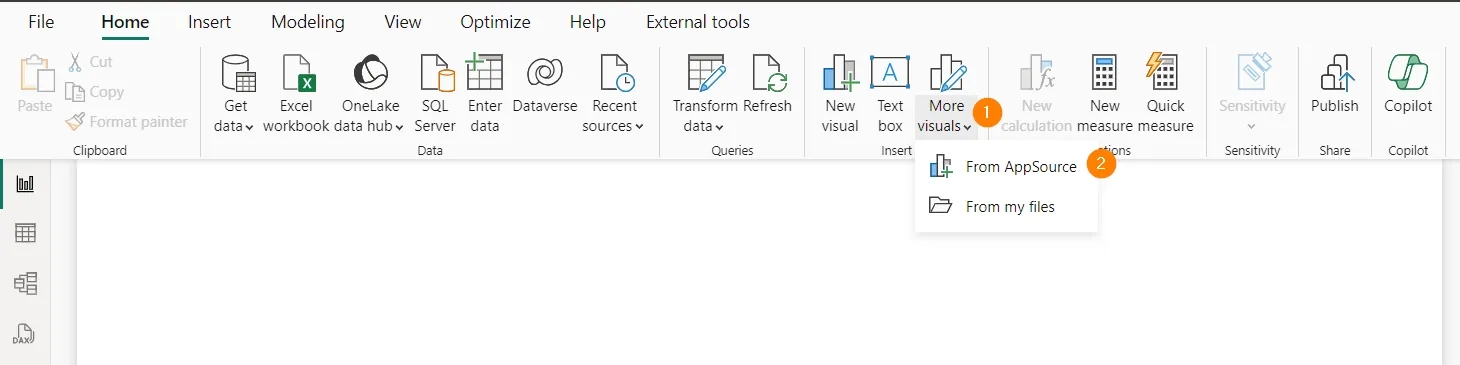
At the time of writing, these visuals are free. Just don’t forget to log in to download them.
So, here’s the plan for the article:
Text Filter
This is the first filter visual I’ll discuss. You can find it by searching and adding it by clicking the Add button.
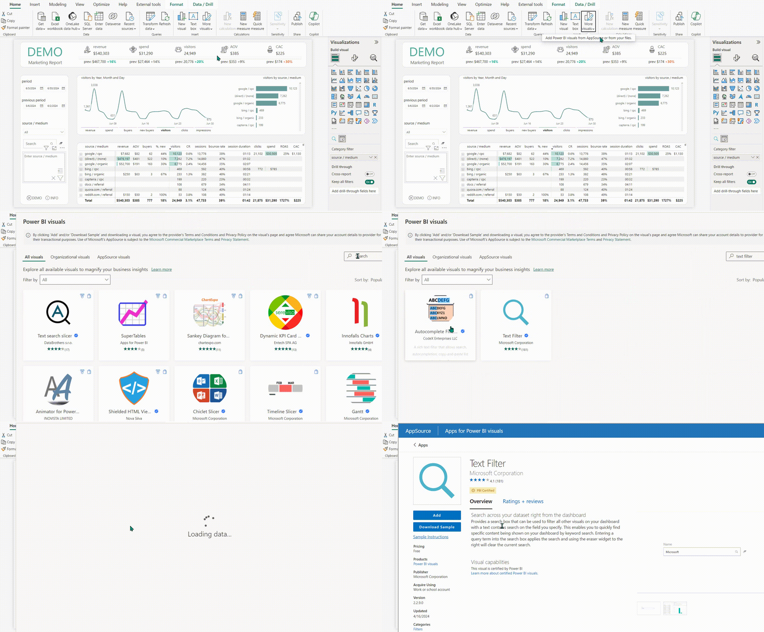
The settings are very simple: you only need to add one field by which we will filter the report. In my case, this is the source and traffic channel. On the formatting tab, there isn’t much you can change. I removed the title because my entire filter block relates to source/medium, which is already indicated above. You can also change the border color of the input field, and that’s all the settings.

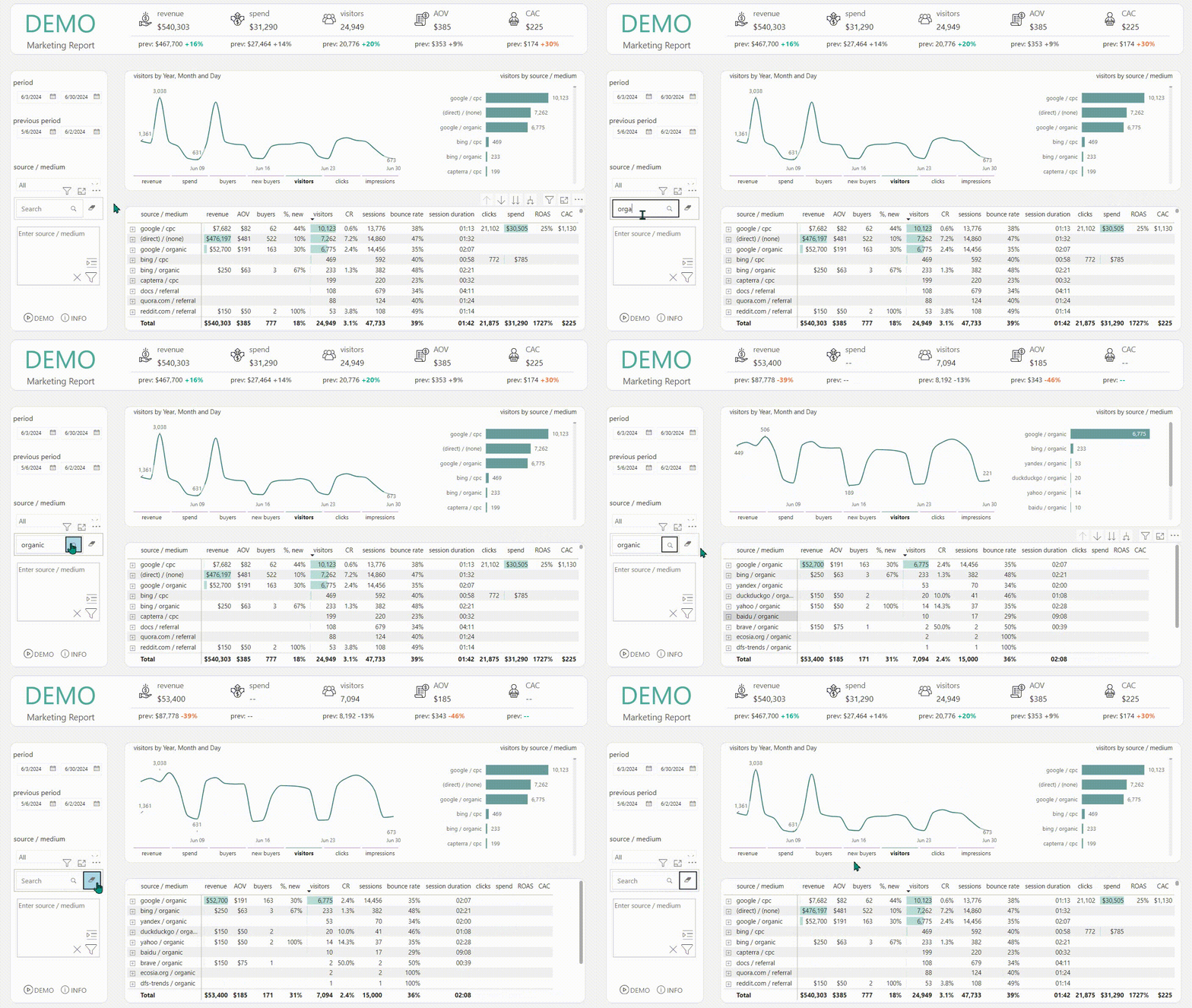
This filter works based on the condition “contains.” That is, if you type in organic, you will see all the data for which the corresponding field contains organic.
The same applies for any inclusion: cpc, google, etc. You can use this filter for campaigns; for example, if you enter “brand,” you will see data for advertising campaigns that include “brand” in their names. I hope from these examples, you have already understood the principle of how this filter works.
Mass Filter
The second filter visual is the Mass Filter. You can also find it by searching AppSource by that name and adding it to your report.
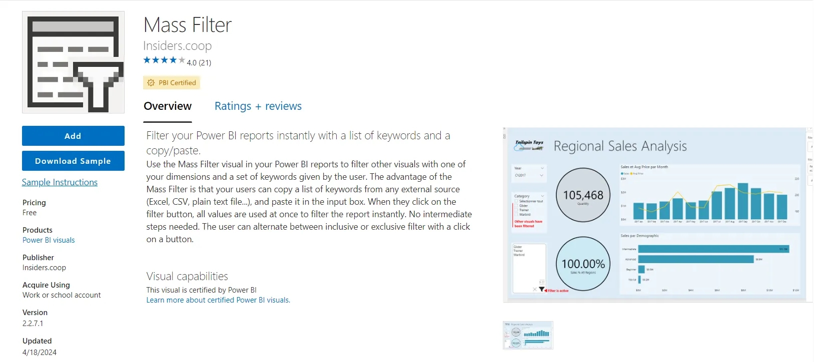
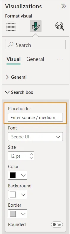
It also accepts a field to filter by, but it has more settings. You will definitely want to enter your text in the Placeholder. Additionally, you can change the font, background color, border, and disable corner rounding if you wish.
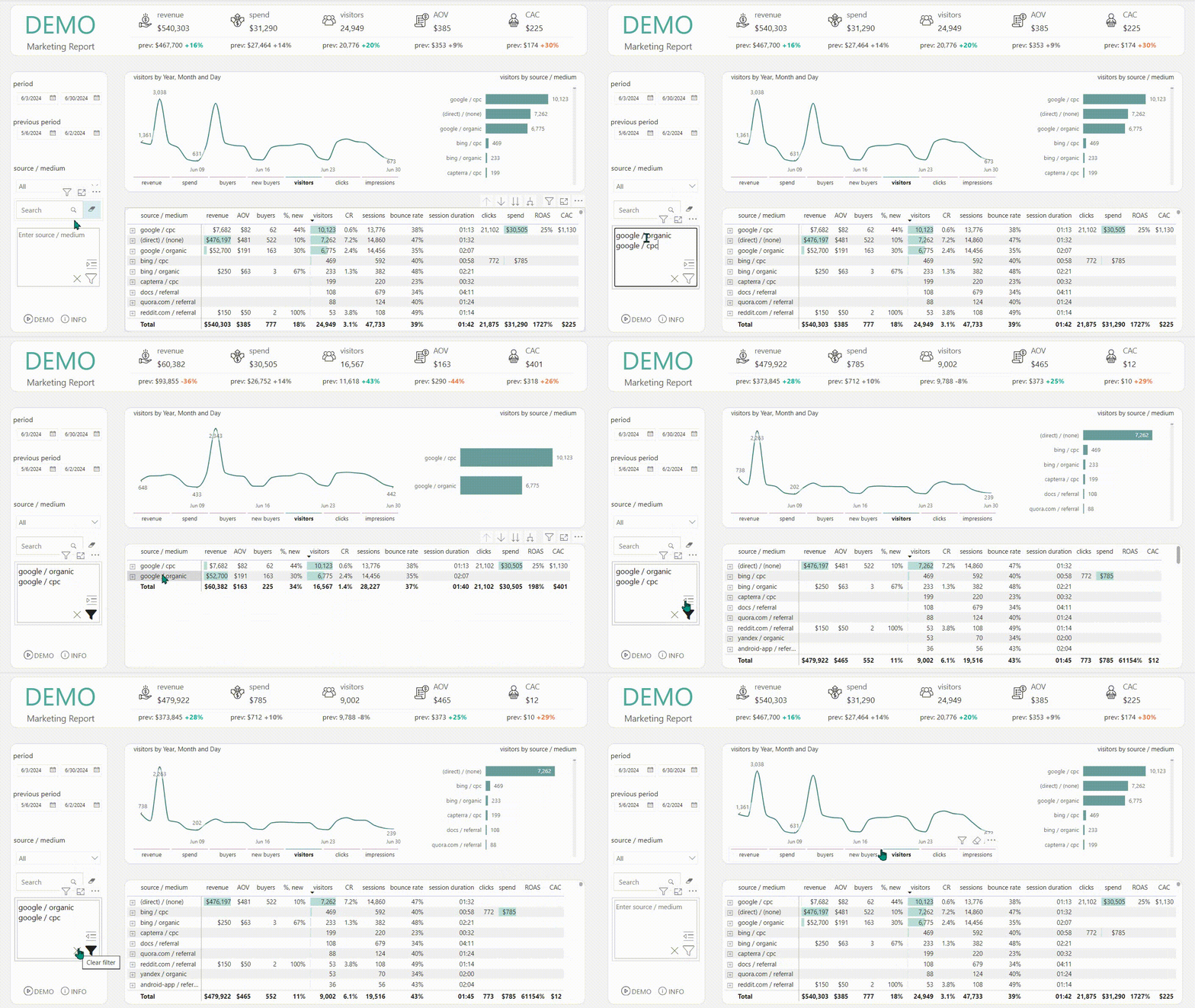
This filter operates on the principle of “equals any value in the list.” In the input field, you add a list of values. Each value should either be on a new line or separated by a comma. After clicking the filter button, you will see data only for the values in the list.
I often use this filter for client lists, such as exports from any third-party system. If you have a corresponding field with this data (ID, email, etc.), you can add it to the filter and see statistics only for those clients.
You can change the principle from “include matches” to “exclude matches,” and you will see data for all values except those specified in the filter.
Filter by Powerviz
This filter is a must-have for everyone. In a data model where at least 2 tables need to be joined, you must create reference tables that contain all the values from the required tables. These reference tables are then linked to the main tables and used in the filter. This results in a very large number of values in the filter, and they are displayed even if there is no data for them in the selected period. The Filter by Powerviz allows you to add a measure that dynamically keeps only the values in the filter for which there is data for that period.
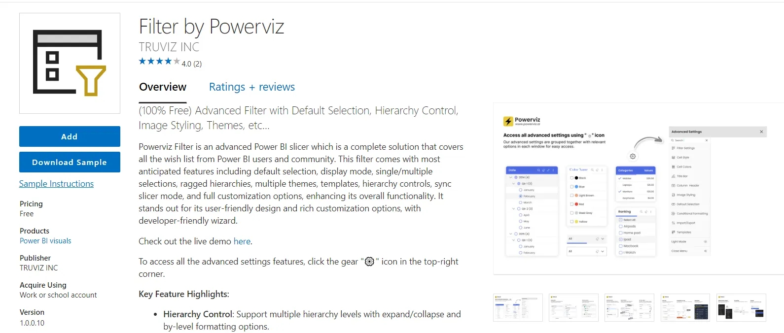
Unlike the previous two filters, this one has a lot of different settings. Initially, when you add this visual and the required field, you will see a pop-up with the first settings. You can choose them according to your preferences. They are quite native and understandable, in my opinion, but I strongly recommend selecting “Pop-up” in the first step. For proper display in “Canvas” mode, this visual needs to be enlarged and stretched over others, which is inconvenient. There will be no issues with “Pop-up.”
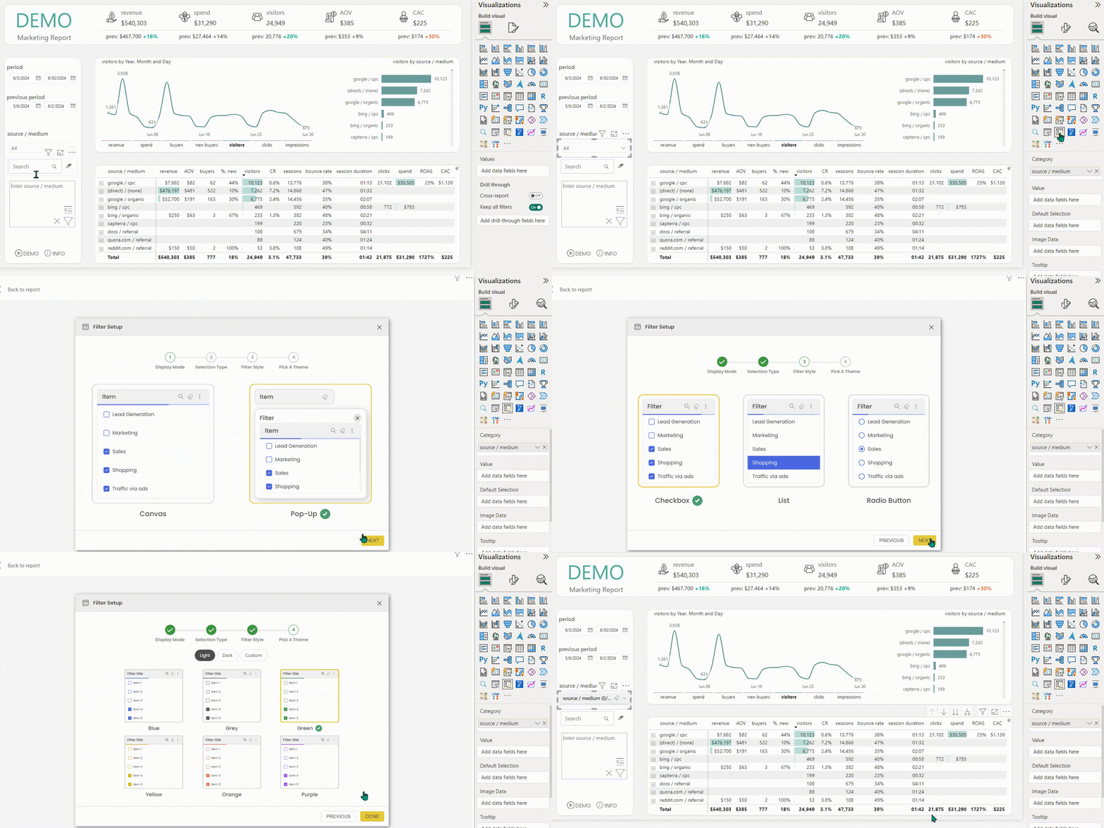
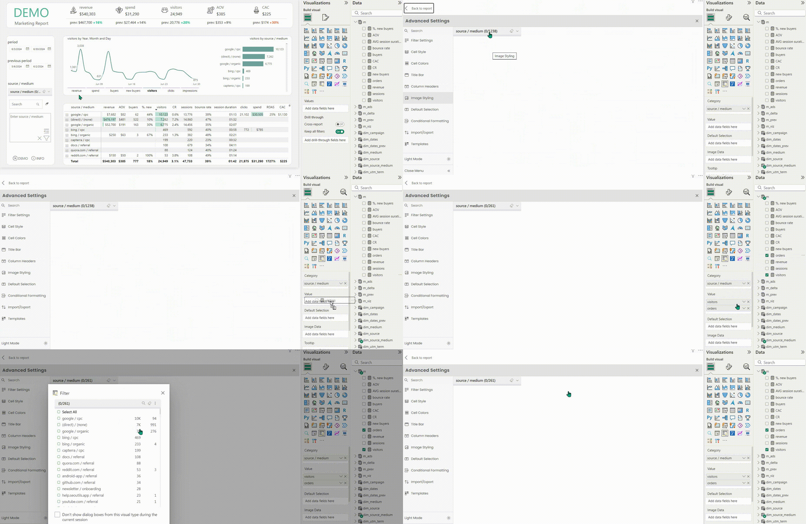
All these settings, as well as many others, are available if you click on the gear icon when hovering over the visual. Here, you add measures that aggregate data from the tables where this common parameter exists. In my case, in the table with sessions and orders from CRM, there is a field called source/medium, so I add a measure called visitors, which counts the website visitors from the first table, and a measure called orders, which counts the orders in the CRM table.
This is necessary to ensure that no sources from which orders were placed but for which there were no sessions during that period or that were not tracked in GA4 are missed. Thus, from over 1200 sources, we are left with only those for which there is data.
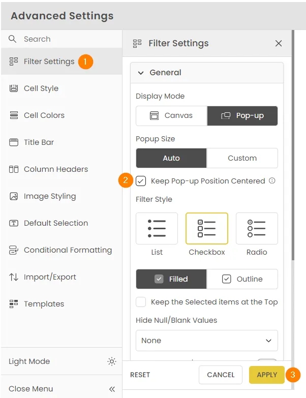
Additionally, I recommend setting the filter window to display in the center. Depending on the placement, automatic display may hide the OK button that applies the filter. If you check this box, this problem will not occur.
And, of course, I recommend adding column names so you can understand what the numbers you see represent.
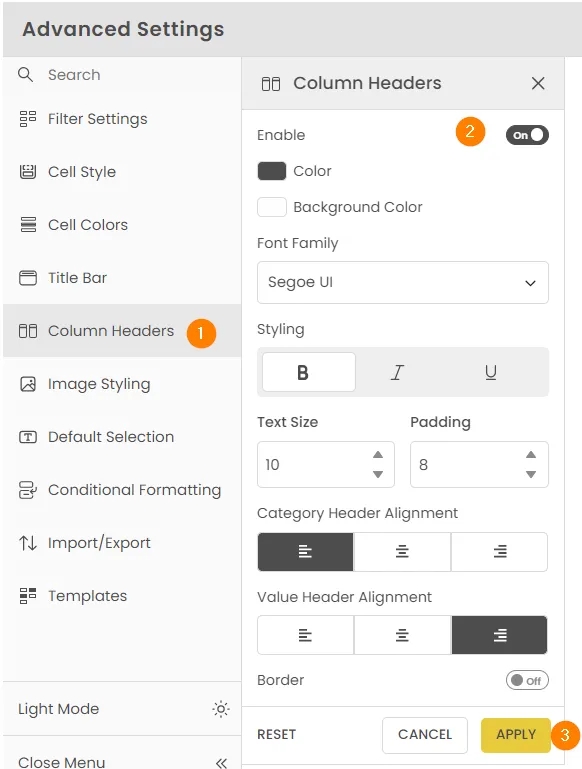
These are the main settings, but not all of them. As you can see, there are many options on the left. Review them and customize the remaining parameters to your liking
Conclusion
It turned into a small article, but I really wanted to share these filters that are not in the list of native visuals in Power BI. I use them quite often. They can be applied to any data: a list of users of the service, the presence of a certain add-on in a user’s subscription, inclusion of a certain part in the name of an advertising campaign, etc. The range of applications is very broad, and I think you will find a use that suits you.
What additional visuals do you use? Share in the comments—I’m very curious! :)
Loading comments…