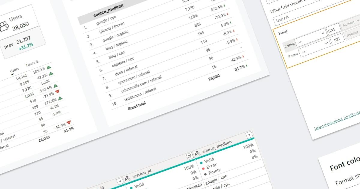

... but I'll start with Looker Studio (LS)
Because in ancient times, when I was just starting to work with Power BI (PBI), being familiar with, at that time, Data Studio, I really lacked the knowledge of how such a comparison can be implemented in PBI. This is the calculation we implement in this article.
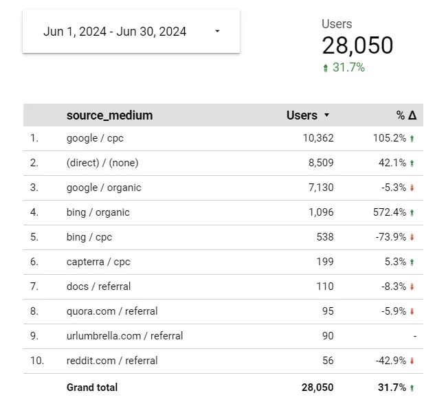
If you dig deeper, you can find arguments against such a comparison and that it is better to set a custom previous period, taking into account, for example, holidays, promotion periods, etc., but this method also has its advantages and can be useful depending on the questions that the dashboard needs to answer:
- this method quickly shows the overall picture - you need to select a period once, and you immediately see the difference with the previous period with the same number of days, that is, you see the general trend in just a couple of seconds.
- if you choose a period that is a multiple of a week (7, 14, 28 days, for example), then the comparison based on weekday/weekend fluctuations will be correct because the previous period will include the same number of weekdays and weekends.
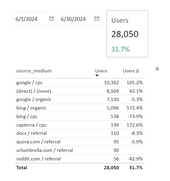
This is how the data will look in Power BI, if you implement the auto-comparison principle. Pretty similar to the first screenshot, isn't it :)
So, our plan for today is as follows:
Data model
Now let's implement it step-by-step. In order not to scatter attention, we will derive a very simple table with:
- session date;
user_pseudo_id(user ID that is automatically assigned by Google Analytics to each device);session_id(combination ofuser_pseudo_idandga_session_idparameter);- traffic source and medium;
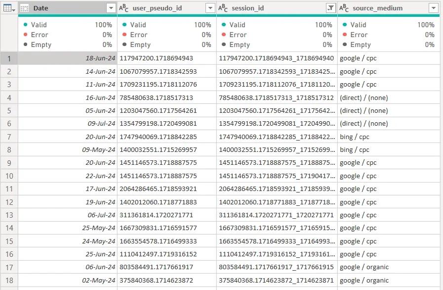
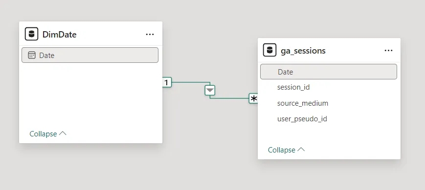
Also, in my small data model there is also a date`s dimension table, i.e. it is a must-have, especially for time-related calculations. And these 2 tables are interconnected by the date field.
Writing calculation measures
First, as in LS, we need to write the measure for calculating the necessary metric. In my case, it’s the number of users, and the formula here is the same as in LS - the number of unique user_pseudo_id.
Users = DISTINCTCOUNT(ga_sessions[user_pseudo_id])Now we count the number of users for the previous period. To do this, we need to specify in the PBI measure the period for which users should be counted.
Users Prev =
VAR maxDate = MAX(DimDate[Date])                        // the last date in the selected period
VAR minDate = MIN(DimDate[Date])                        // the first date in the selected period
VAR delta = DATEDIFF(minDate, maxDate, day)             // the number of days between the first and last date
VAR prevMax = minDate - 1                               // the end date of the previous period
VAR prevMin = prevMax - delta                           // the start date of the previous period
VAR prevValue =
    CALCULATE(
        [Users],                                        // measure that calculates the necessary value
        DATESBETWEEN(DimDate[Date], prevMin, prevMax)   // dates of the previous period for which the value should be calculated
    )

RETURN prevValue
Let's analyze the measure step by step:
- Store the last date selected in the filter in the
maxDatevariable. In our case - June 30.. - Store the first date selected in the filter in the
minDatevariable. In our case - June 1. - In the
deltavariable, with the help of DATEDIFF function, we count the number of days (3rd argument - day) between June 1 (minDate) and June 30 (maxDate) and get the value 29. - The
prevMaxvariable calculates the end of the previous period by subtracting one day from June 1 (minDate) - that is, we will count users until May 31. - The
prevMinvariable calculates the beginning of the previous period by subtracting 29 (the value of thedeltavariable) from May 31 (prevMax) - that is, we will count users from May 2. - The last variable
prevValueuses the CALCULATE function, which uses the measure created in the previous step (the unique number of users) as the first argument. In the second argument, we use the DATESBETWEEN function, which returns a list of dates from the DimDate dimension in the range between May 2 (prevMin) and May 31 (prevMax), thereby giving the formula a specific time interval for which users should be taken and their unique number counted.
Congratulations! You have read the most difficult part of this article :)
The user delta is calculated very simply: in the numerator, we count the difference between the number of users for the current and previous period ([Users] - [Users Prev]) and divide it by the number of users for the previous period ([Users Prev]).
Users Δ = DIVIDE([Users] - [Users Prev], [Users Prev])After we have written the measure, select the Percentage type and the number of decimal places = 1.

Conditional value formatting
We add this measure to the table with the number of users ([Users]) and the source_medium parameter. And for the card I will use a visual called "Card (new)". I add the measure [Users] to the value, and to display the delta we do the following: go to the Format visual tab -> open the Reference labels item -> select the added measure [Users] from the list -> for it add the measure [Users Δ] to the label - > below, select the added label from the previous step.
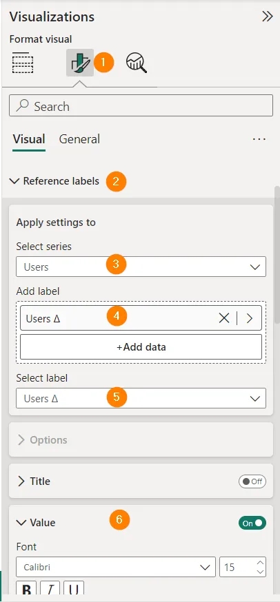
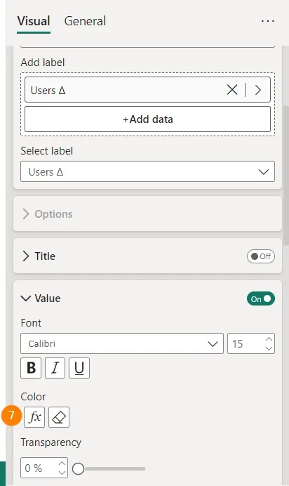
Next, open the value settings of the label (Value) -> click on the fx icon in the color item (Color).
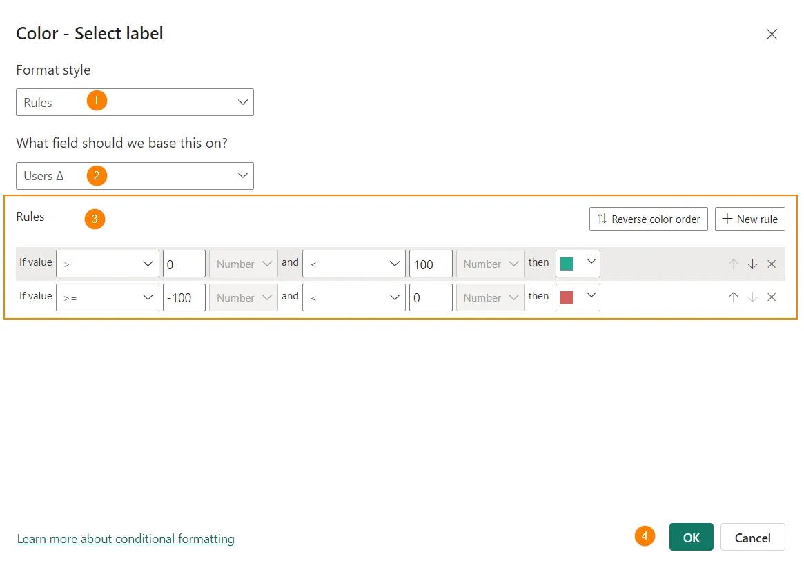
Now we set the conditions: if the delta is greater than 0 - display the value in green, if less - in red.
And we get the final look:
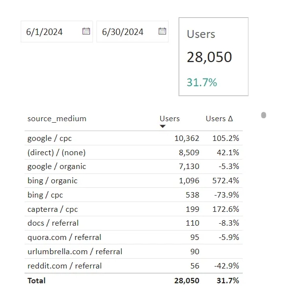
…but something is missing…
Adding icons
To add them, click the menu next to the delta measure -> Conditional formatting -> Icons.
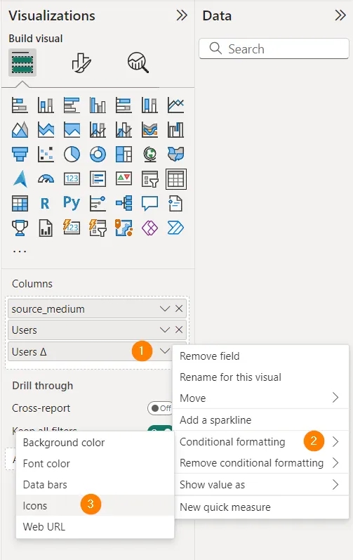
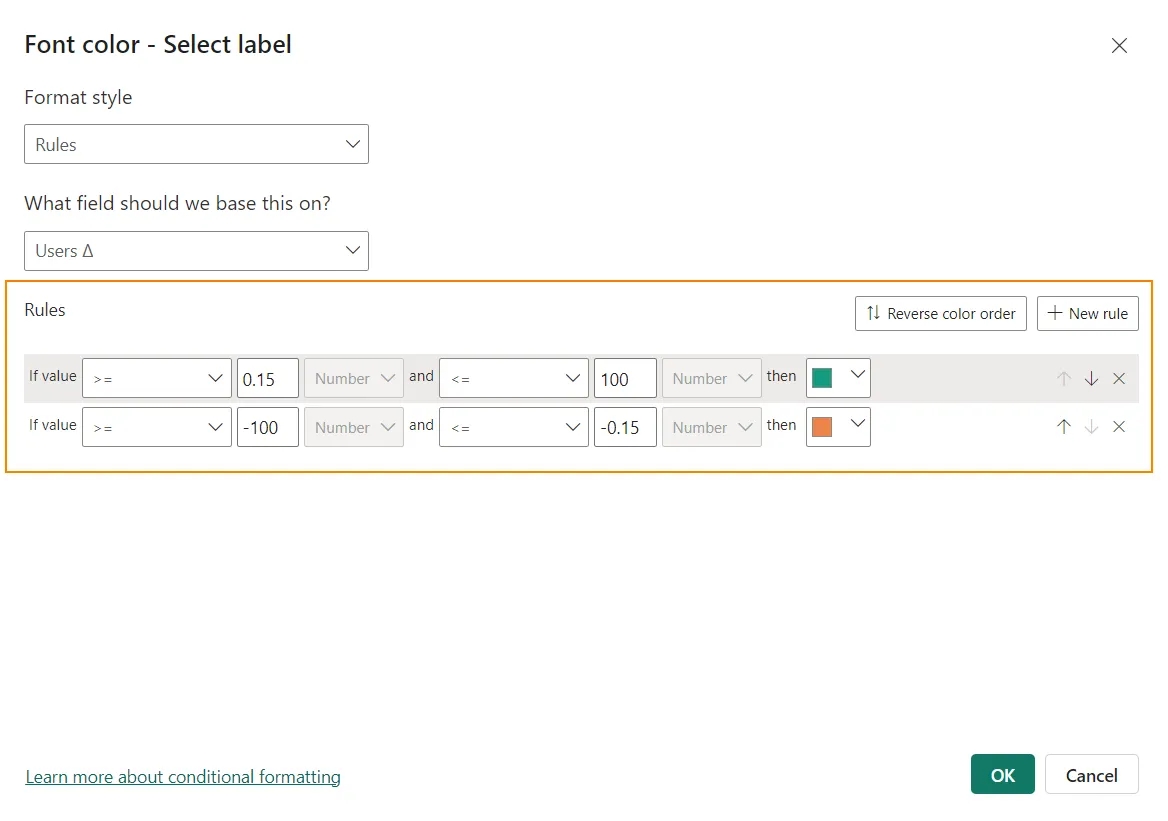
A familiar window opens, where we choose the following settings:
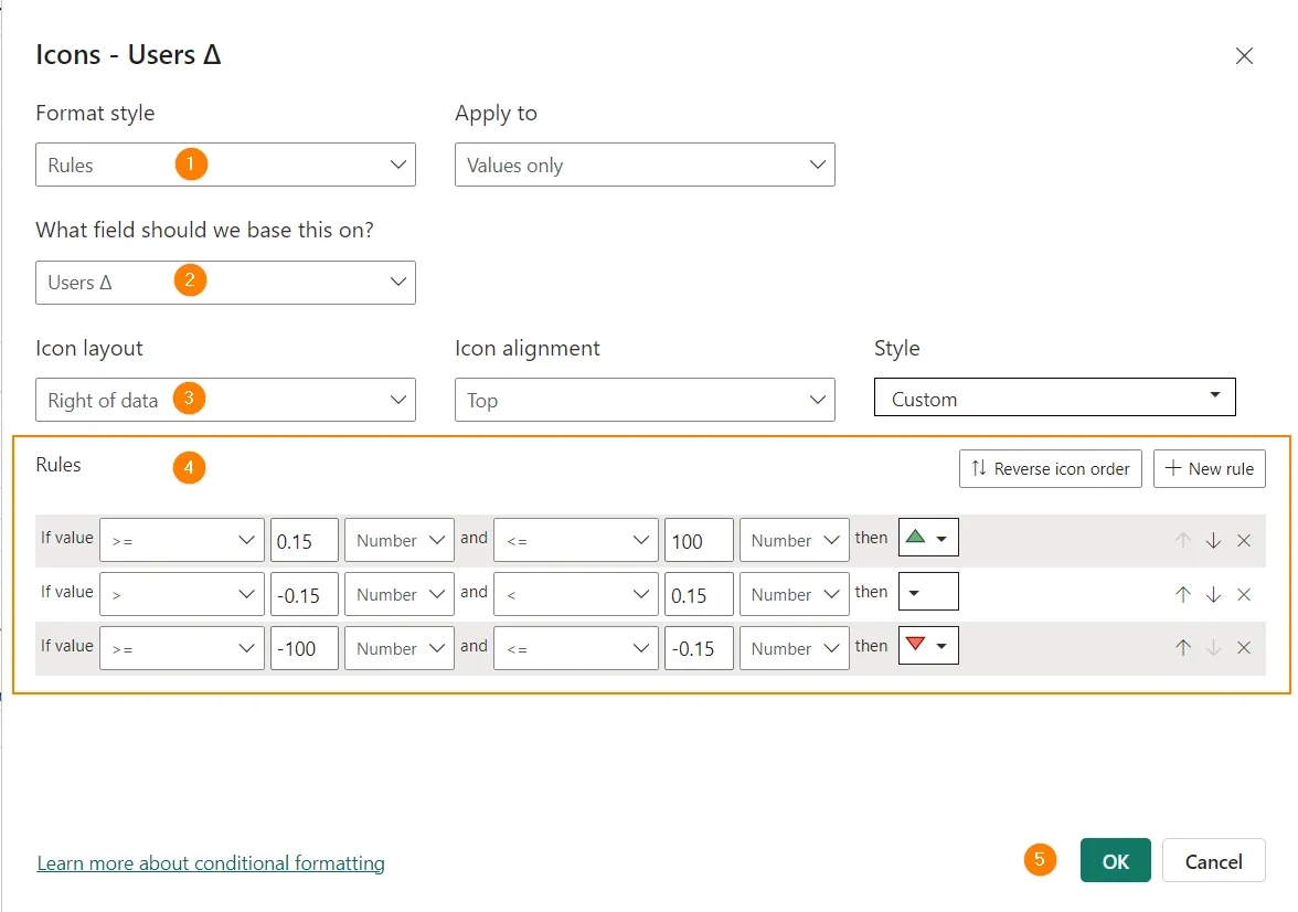
There is one feature in these settings - the second condition. I don't display an arrow if the delta is between -15% and +15%. This reduces the amount of noise in the visual because it doesn't draw attention to small fluctuations. You, of course, set the conditions yourself depending on your needs.
Click OK and get the following result - the table draws our attention only to what is worth it, and not to everything, as in LS:
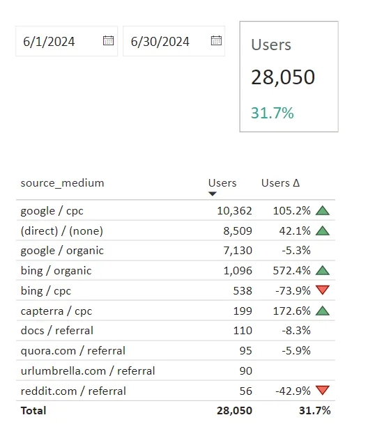
Changing the color of the indicator
If you don't like icons, you can, for example, choose Font color in the conditional formatting menu, and write conditions for the color of the delta value:
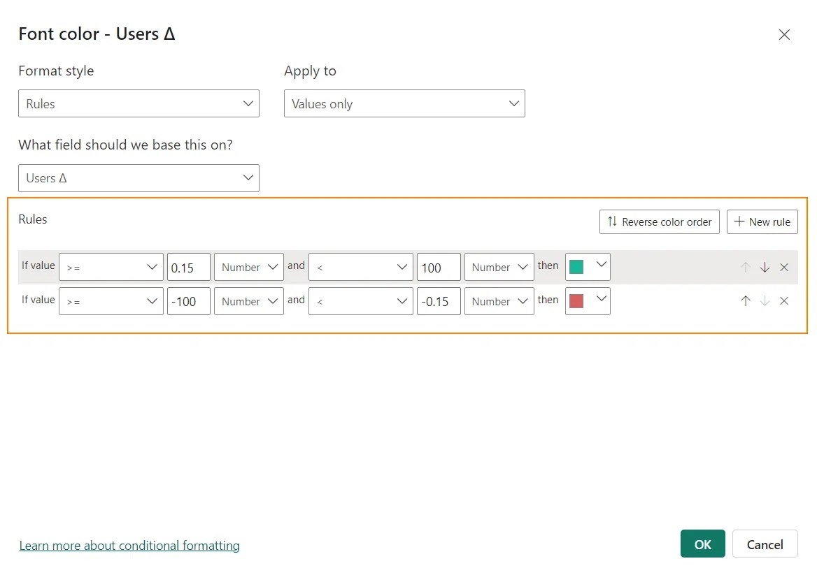
The result will then be:
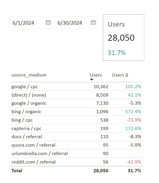
Displaying additional data
Sometimes it seems to me that Power BI has unlimited possibilities for working with data, the main thing is to understand them. For example, LS, as of now, can display either an absolute delta value or a percentage.
I'm not an LS guru, so comment below if LS can show both values at the same time. There are no such restrictions in PBI - display everything you need, in the form you need.
Let's first show on the card the absolute number of users for the previous period. At the same time, we will set a custom concise name for this metric.
For this, we create a new measure:
Users Prev Viz = "prev " & FORMAT([Users Prev], "#,#")The FORMAT function can change the display format of values. I have “#, #” - this is how an integer with comma-separated thousands is displayed. More about the formats - in this video and this one.
And we use the measure in the visual as a label, disabling the title:
- Go to the visual formatting tab;
- Open the Reference labels item;
- Add the main measure Users;
- Add the label - the measure created in the previous step - Users Prev Viz;
- Choose a label from the list;
- Turn off the title, because we have already written what we want to see;
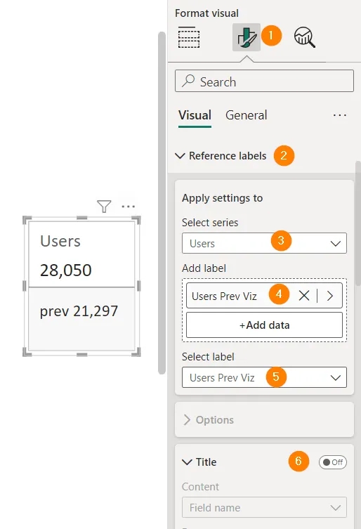
We add the delta (Users Δ) in the item below - Detail.
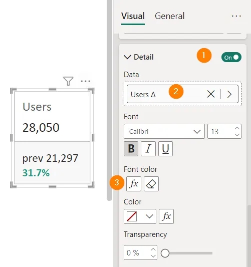
And for font color, we set the already familiar conditions:
Adding an image to a card
Of course, it already looks much better than the previous version, but it can be done even better. Let's do so:
- We slightly change the measure [Users Prev Viz] to:
Users Prev Viz = "prev⠀" & FORMAT([Users Prev], "#,#") & REPT("⠀", 10)- Here, "prev⠀" does not have a trailing space, but an invisible symbol that can be taken from this link.
- In the & REPT("⠀", 10) part, it is also added to the REPT function, which repeats the value from the first argument as many times as specified in the second (10).
Due to this, the value "prev 21,297" will always be written in one line when changing the width of the visual.
- We also modify the delta measure with functions already familiar to you:
Users Δ = REPT("⠀", 4) & FORMAT([Users Δ], "+0.0%;-0.0%;0%")- REPT("⠀", 4) is used here to move the value to the right and place it immediately below the absolute value.
- Since the format of the entire measure here can only be Text, we use FORMAT and "+0.0%; -0.0%;0%", which specifies the delta formatting rule: display it as a percentage with 1 decimal place, and if the value is greater than 0, add “+” in fron of it, if less, then add “-”, or leave 0%.
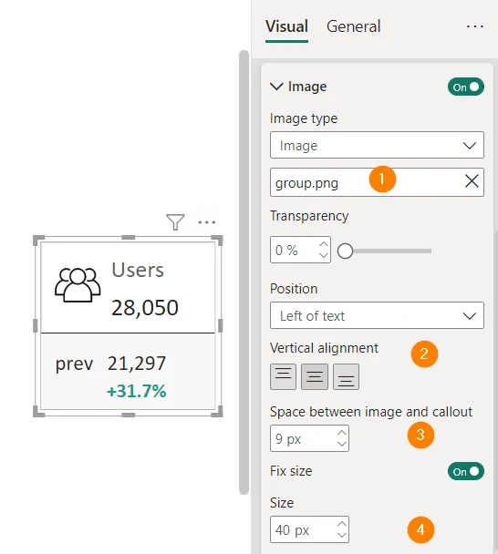
And we can add an icon to visualize the value in the Image item. Since I count users, I found and downloaded to my laptop a vector icon, which is common for such a metric. I took it from here, but there is an unlimited number of similar websites.
In the settings:
- Select the saved picture;
- Place it to the left and in the middle of the metric;
- Give 9 pixels of "air" between the picture and the metric;
- Set the image size to 40 pixels;
The final result
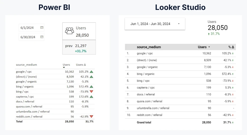
As a result, we have this look. On the right is a comparison with Looker Studio.
In my opinion, in Power BI we achieved a better result - we showed more data, while focusing on those changes that are significant. This makes data reading faster because the user has to spend more time implementing the insights generated by the visual, rather than understanding it.
Looker Studio's bug or feature
Instead of a conclusion: I noticed the following feature of LS - if you set the period for June not by choosing dates, but choose the last month, LS compares with the full month of May, that is, from May 1 to May 31, which is 1 day more than in June...
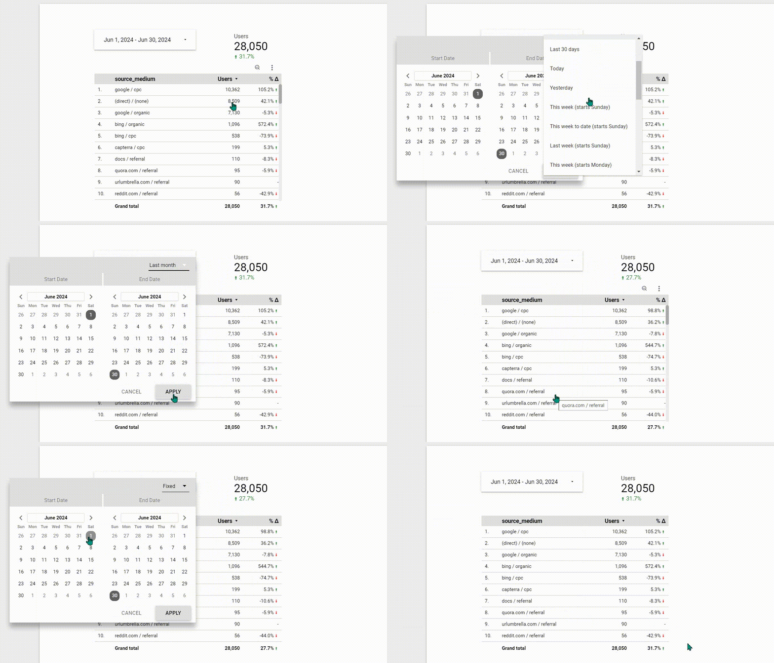
I believe that such behavior is not entirely obvious, and such a comparison is not correct in most cases.
But this is my opinion. If you think otherwise - share in the comments.
But I am especially interested to know from frequent users of LS - is it possible to make the same clear and concise visuals there?
Loading comments…