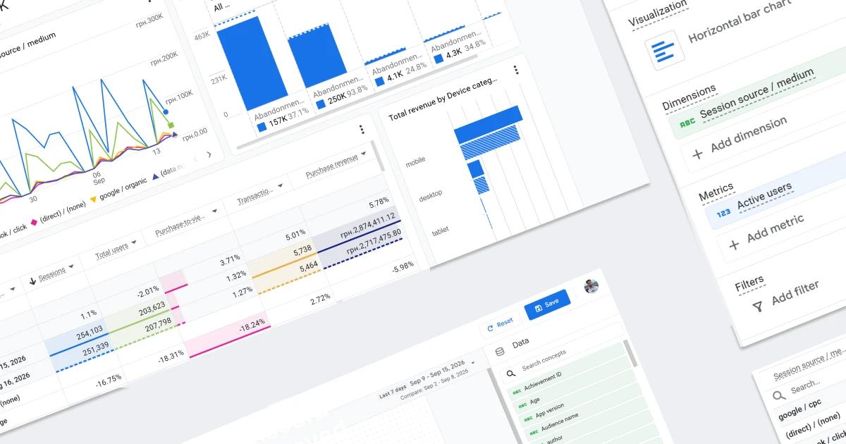
The Complete Guide to Dashboards in Google Analytics 4: Why It's Not a Data Studio Replacement — and Why It's Worth Your Attention

A few weeks ago, I got my first look at the new Dashboards feature in GA4. My initial reaction was to write a headline like "Google Data Studio is dead," but if you stop and think about it — and look at the recent changes across the Google ecosystem — the picture turns out to be much more interesting. What's more, since then I've had time not only to read about the update but to try it out myself. So here's what's ahead: a walkthrough of the feature's capabilities, the nuances I noticed along the way, and, at the end, my thoughts on the whole thing. Let's dig in.
What Are Dashboards in Google Analytics 4?
This is one of those cases where it's better to see it once than hear about it several times. So here's a screenshot showing what a dashboard actually looks like.
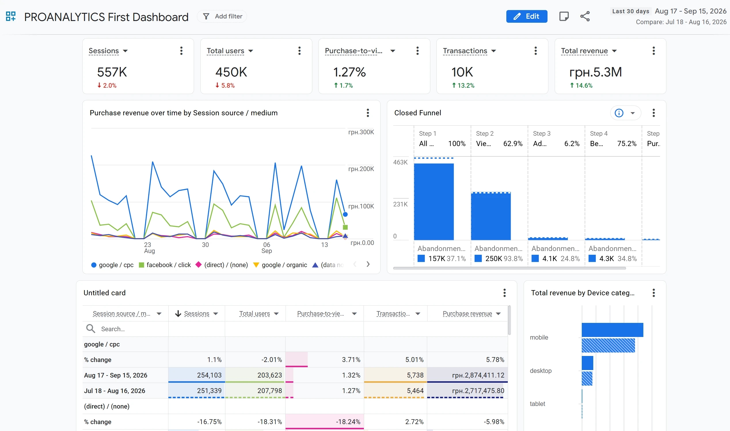
In plain terms, it's a way to pull the data you need from different reports and explorations onto a single page. At first glance it might look like Data Studio, and in some ways it is — the functionality overlaps — but they're still two different tools, and as you'll see below, their capabilities diverge quite a bit too.
How to Build a Dashboard in Google Analytics 4
Before you build your own dashboard, let's first walk through the interface and its capabilities.
Getting to Know the Interface
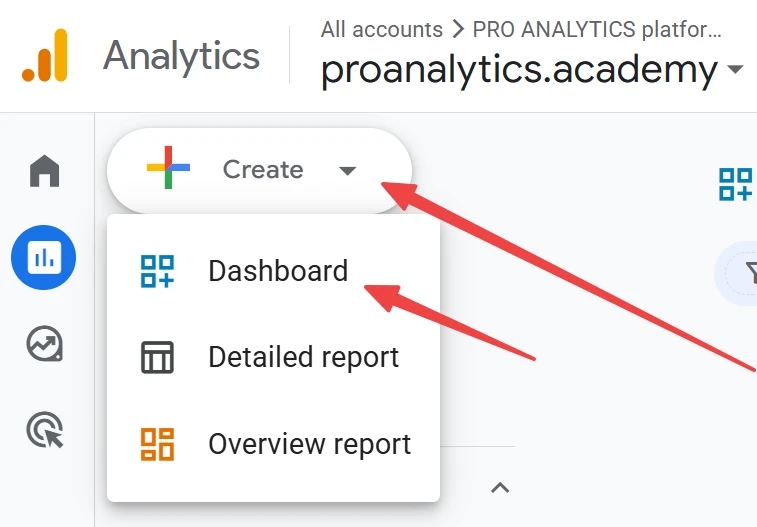
Start by going to the Reports section and clicking Create dashboard in the top-left corner:
This opens up the dashboard-building workspace:
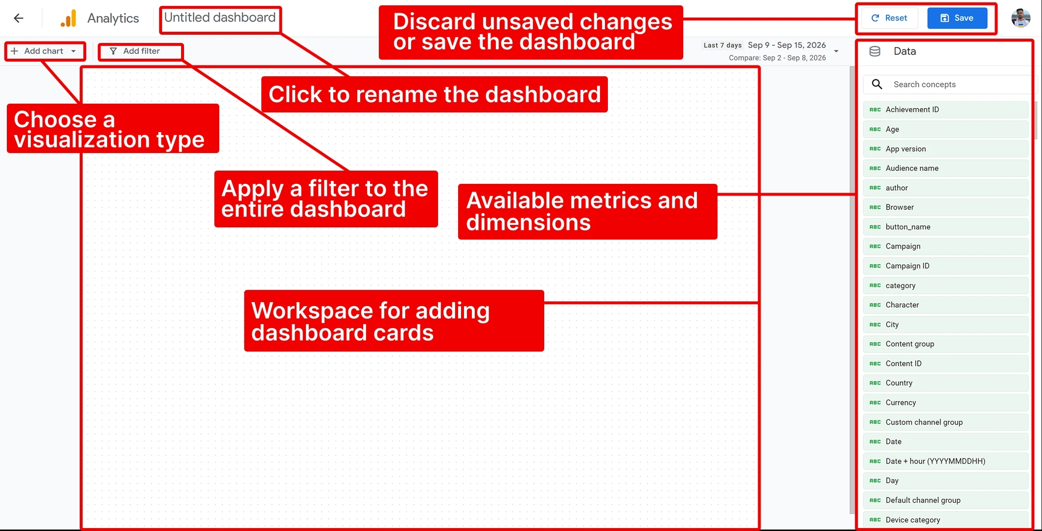
- Most of the space is taken up by a blank canvas, where you'll actually build your dashboard out of the visualizations you choose.
- On the right is the Data panel, listing all the available metrics and dimensions (and the unavailable ones too — more on that later).
- At the top, you can choose the type of visualization you want and set filters that apply to the entire dashboard.
At the very top, you can rename the dashboard, save your changes, or hit Reset, which rolls everything back to the last saved state.
The build process itself is pretty simple and intuitive. There are two ways to go about it:
- Drag the metrics you need straight from the Data panel onto the canvas, then change the visualization type afterward;
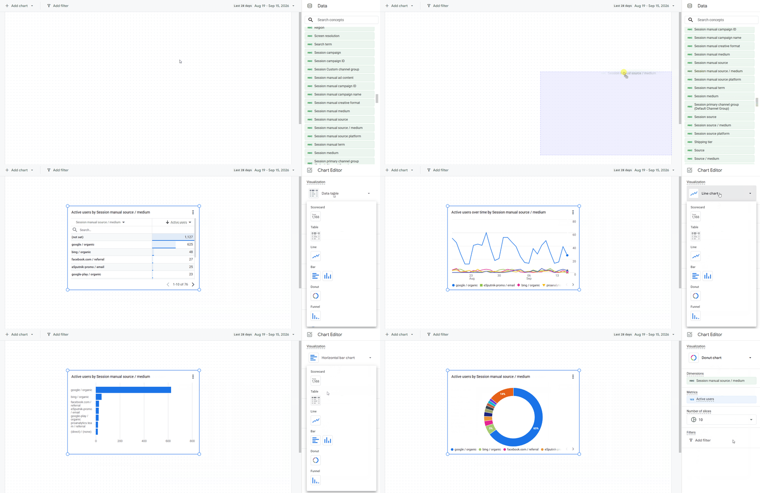
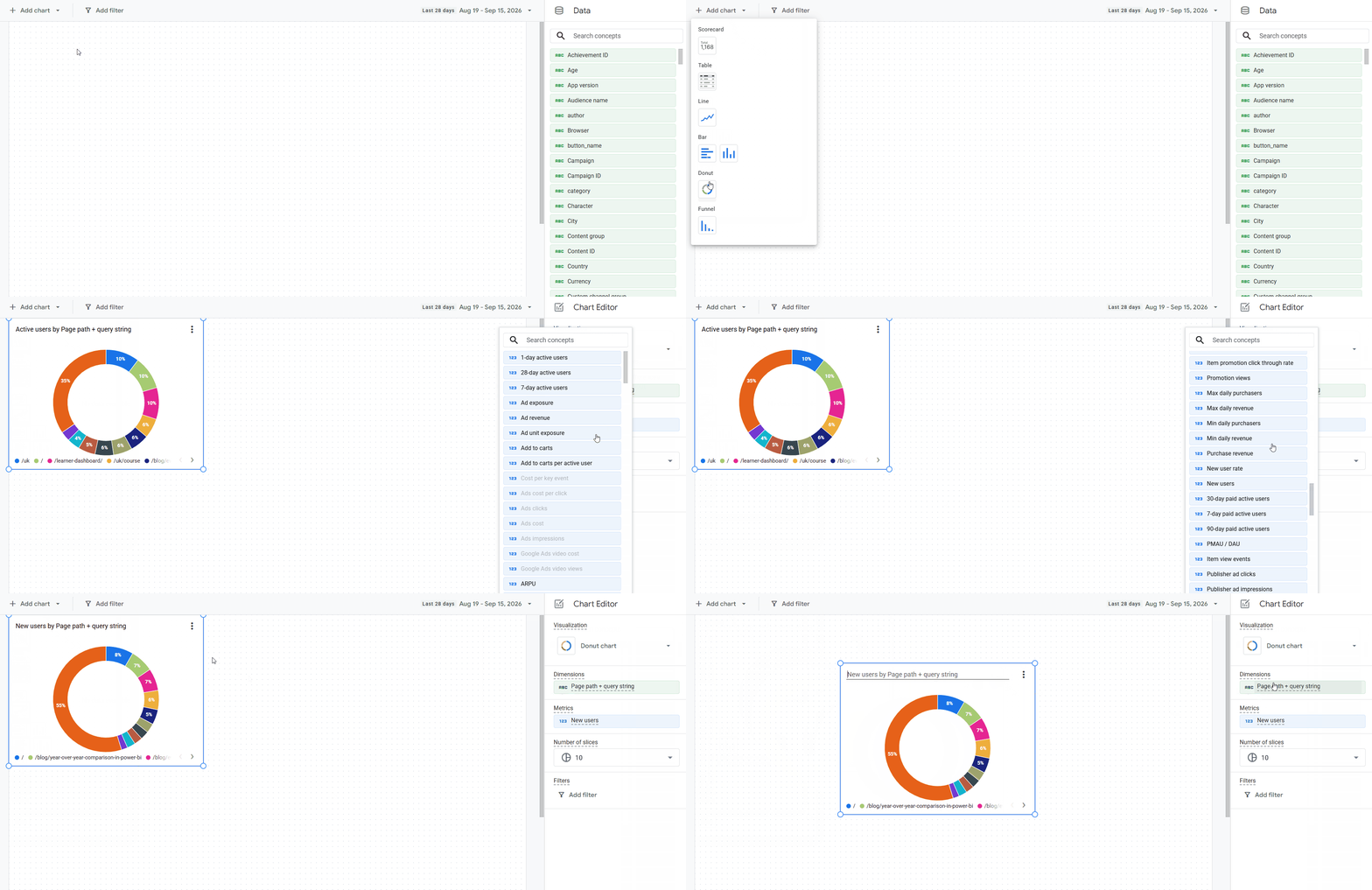
- or pick the visualization type first, and then add the metric you need.
What Types of Widgets (Cards) Can You Add to a Dashboard in GA4
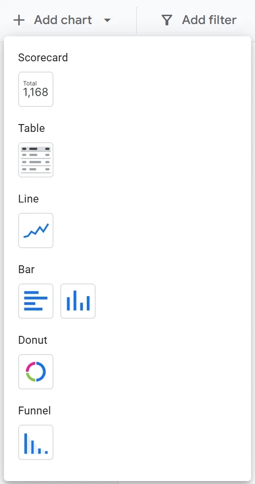
There are seven types of visualizations available: Scorecard, Table, Line chart, Bar chart (both horizontal and vertical), Donut chart, and Funnel chart. Below, I'll cover each one in detail — with a visual example, its capabilities, and the nuances I've run into.
Scorecard
This lets you display a metric's value for a chosen period. It's the type you'll reach for most often to surface core KPIs — users, purchases, revenue, and so on. It's especially handy that it natively supports period-over-period comparison.
In fact, as you'll see below, every visualization type handles period comparison well, except for the Bar chart:
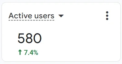
Aside from choosing the metric, the settings also let you set a filter and use the Concept picker (just click the widget to open its settings):
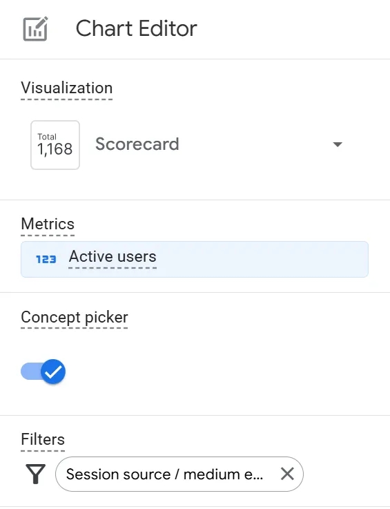
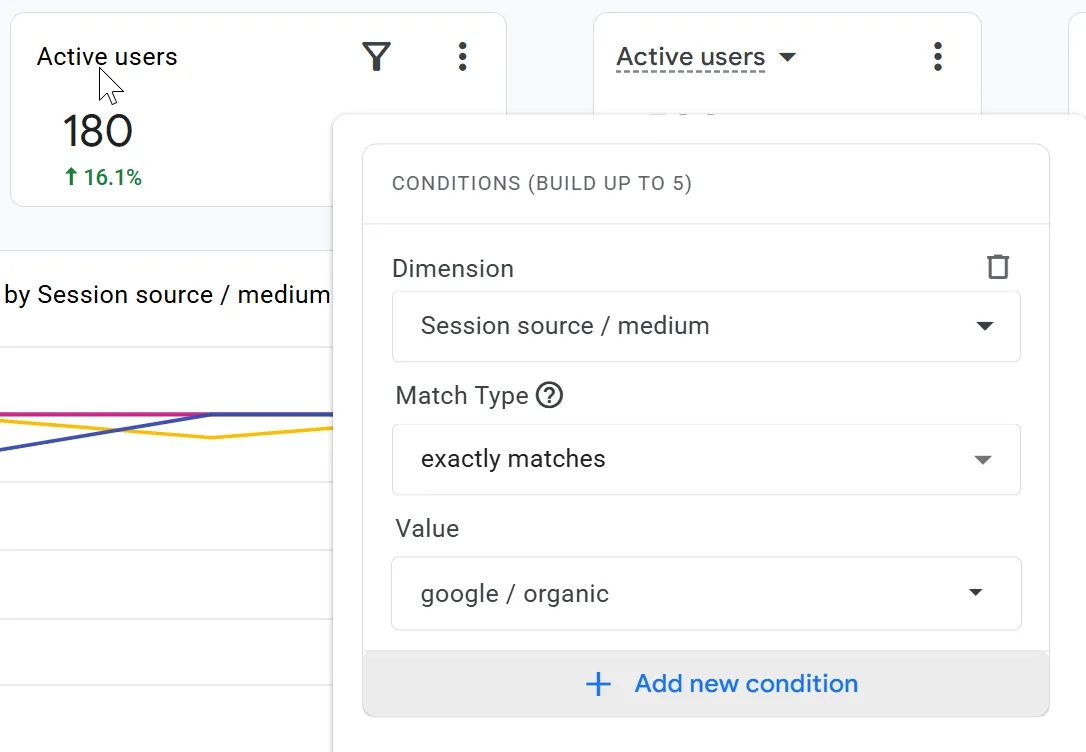
- The filter supports up to five conditions, and you can even change a condition while viewing the dashboard. So I don't have to repeat this for every widget: widget-level filtering is available for all visualization types and works the same way across the board.
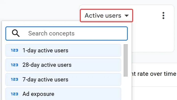
- As for the Concept picker, it's a genuinely interesting feature: it lets you swap the metric shown in a Scorecard right from viewing mode, without needing to edit the dashboard. It looks like this. Since viewing a dashboard requires fewer permissions than editing one, this is a smart solution — it lets even users without edit access change the metric directly on the dashboard.
Table
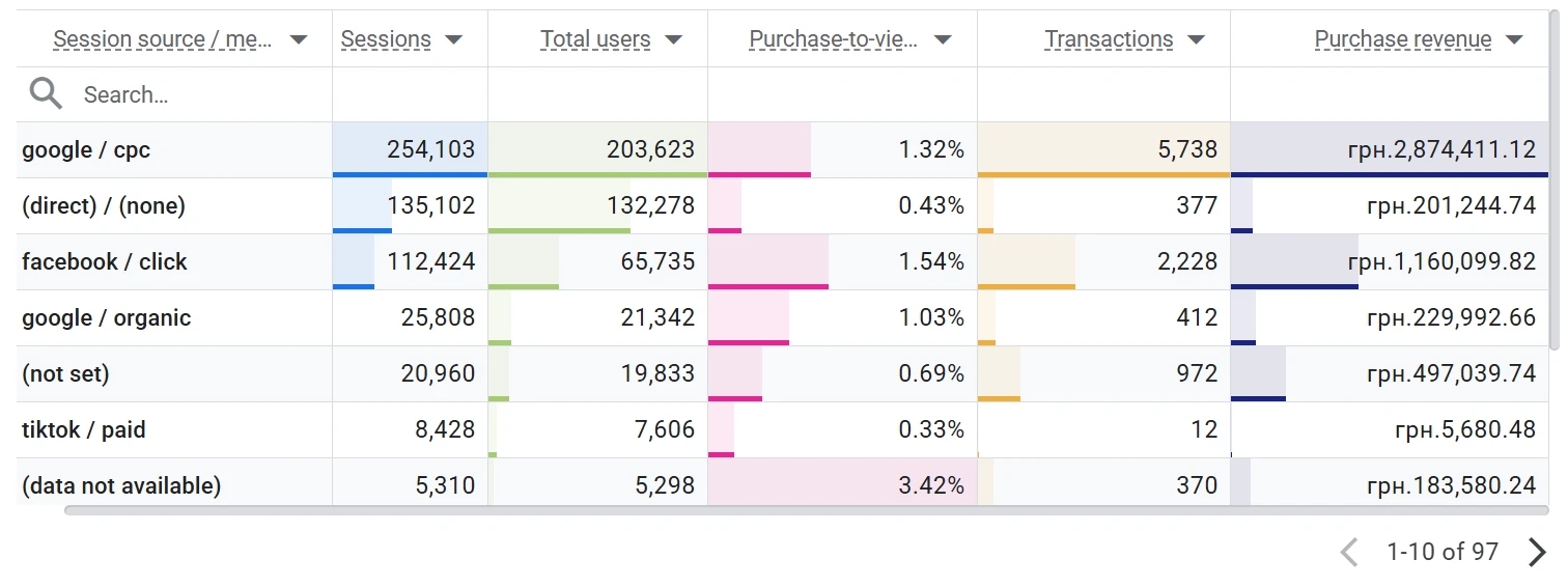
I don't think this one needs much explanation — everyone knows what a table is and what it's for — so let's get straight to the interesting details:
- You can add up to five dimensions and fifteen metrics at once.
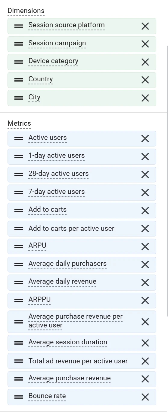
The Concept picker here works on the same logic as in the previous widget, but with more flexibility: a single toggle controls both metrics and dimensions at once.
Given the point above, you can now build a table with five dimensions and fifteen metrics, and swap any dimension or metric for another at any time using a quick dropdown.
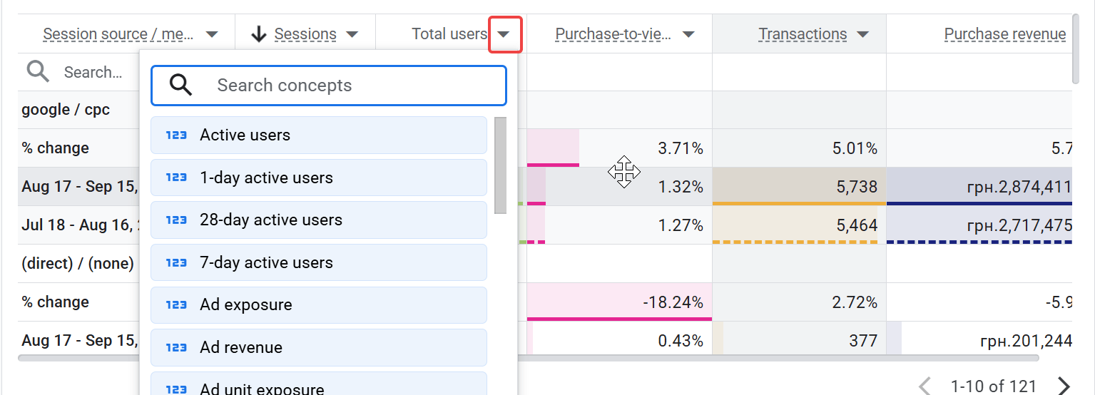
- The Table display settings block has two options: Show search bar and Show totals row.
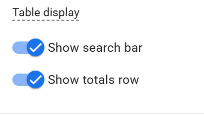
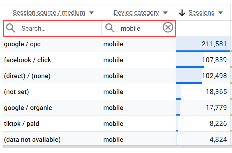
The second option is self-explanatory — whether or not to show totals in the table — but the first one is a genuine improvement to GA4's capabilities. You can now filter by any dimension directly within the table, with its own search field for each dimension column:
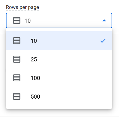
One more setting lets you choose how many rows the table displays: 10, 25, 100, or 500:
And a few more useful things in viewing mode:
- You can now resize column widths right in viewing mode:
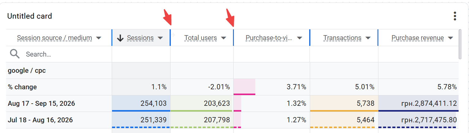
- In-cell bar charts are turned on by default. It looks nice, but personally I find it can sometimes make the table harder to read at a glance. I'd also like to see calculated metrics compared against the average, rather than just a simple "higher is better" indicator.
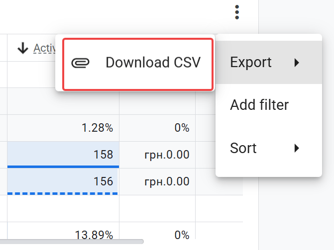
- And of course, they didn't forget the ability to export data to CSV — you can't build a proper dashboard without that option (and it's available on every widget, by the way):
Sorry, couldn't resist.

Line Chart
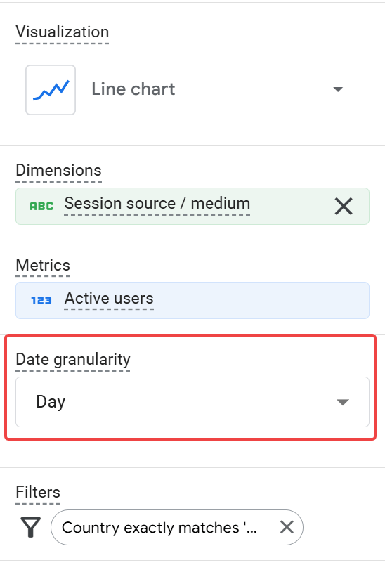
There's not much to say about this one: it's a classic line chart where you pick one metric to display and, if needed, one dimension to break it down by. It's best suited for showing a metric's trend over time. The only setting available is date granularity — you can display data by day, week, or month.
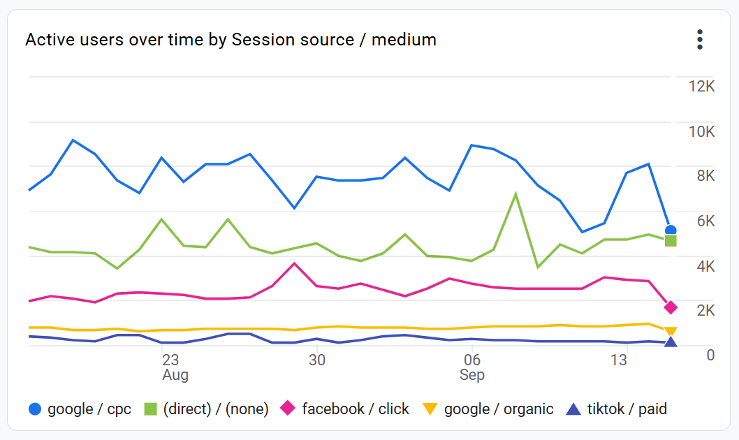
What they didn't add, though, is a Concept picker for switching the displayed metric in viewing mode — which, in my opinion, would matter even more for a line chart than for the other widgets.
Bar charts
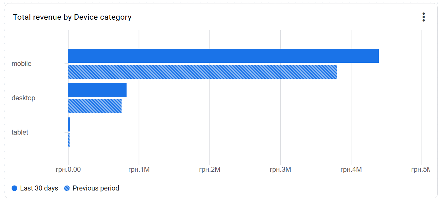
This visualization type works best when you need to compare a metric's value across different categories — devices, countries, or traffic channels, for example. It has even fewer settings than the line chart: you can choose the dimensions and metrics you want, and that's about it.
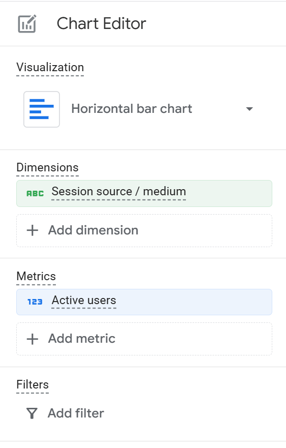
That said, I would NOT recommend adding more than one dimension or more than one metric, since both make the chart hard to read (especially when you're viewing it in comparison mode):

In general, I'd recommend being quite careful with this widget, since it currently has a bug in its tooltip:
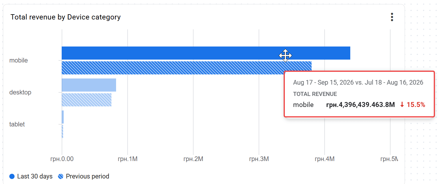
Even though the current period's numbers are actually better, the tooltip shows the opposite.
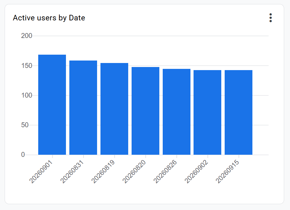
You can also build a vertical bar chart, but without the ability to choose the sort direction, this visualization loses most of its point — it ends up looking like this:
Donut chart
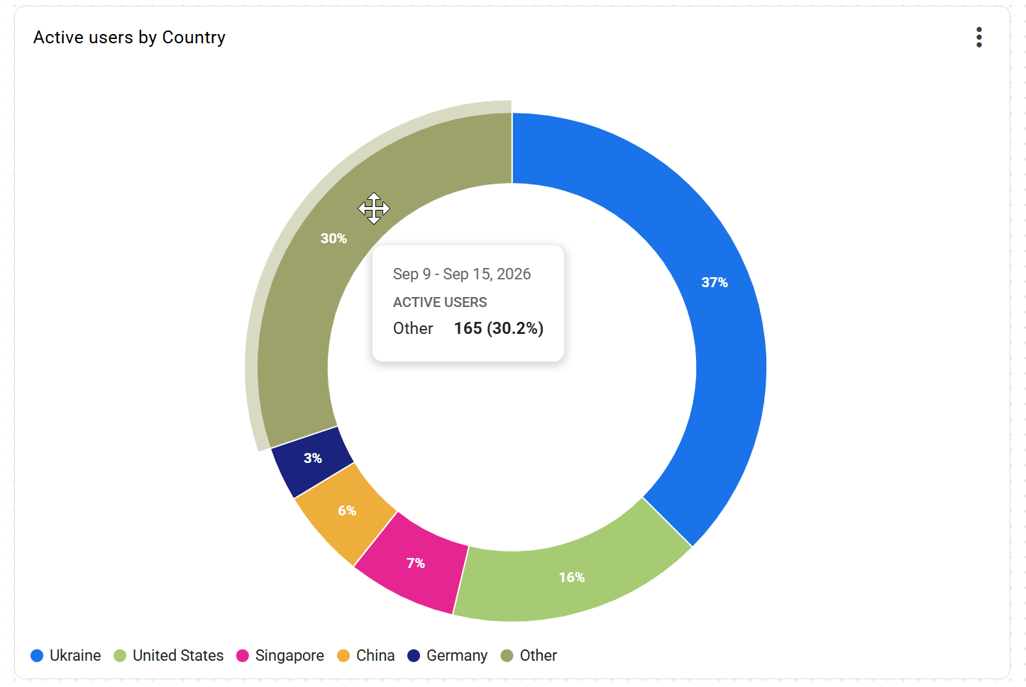
This visualization type works best when you need to show the composition of a whole — what share of the total each category accounts for. It works best with a small number of categories.
As for settings, it's the classic choice: one metric and one dimension.
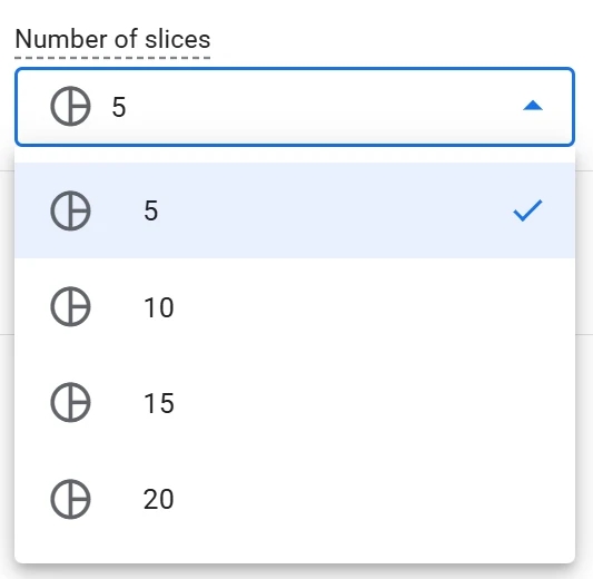
One interesting feature is the ability to choose the number of slices in the donut
(my advice: don't pick more than five, and don't make life harder for whoever has to read this dashboard). More importantly, if there are more values than the number set, GA4 automatically groups the rest into "Other," so you're never left with a misleading picture
Funnel
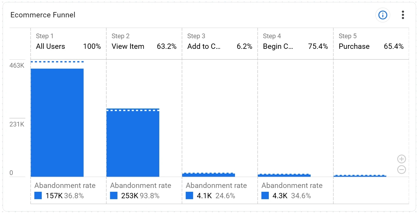
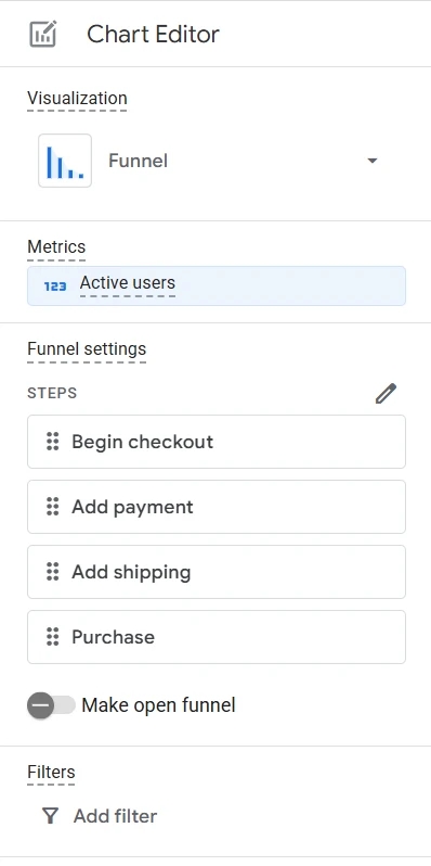
The last of the available visualizations is the funnel. And in my opinion, it's one of the most interesting parts of this update.
If you've ever built a funnel in Data Studio, or even in a proper BI system, you know that funnels — closed funnels especially — are a fairly complex task. Especially once you factor in all the filters and other nuances that can affect them.
And this is exactly where GA4 dashboards shine. The funnel-building interface here is just as intuitive as in the Explore section, with the same set of capabilities. So I won't take up more of your time on that — I've already covered funnel-building in GA4 in detail here.
What Else Is Useful to Know About Dashboards in GA4
In this section, I've gathered various nuances and known limitations — some from the official help documentation, and some from my own hands-on experience with the tool:
- Data imported into GA4 from other systems isn't currently supported (this includes Google Ads data).
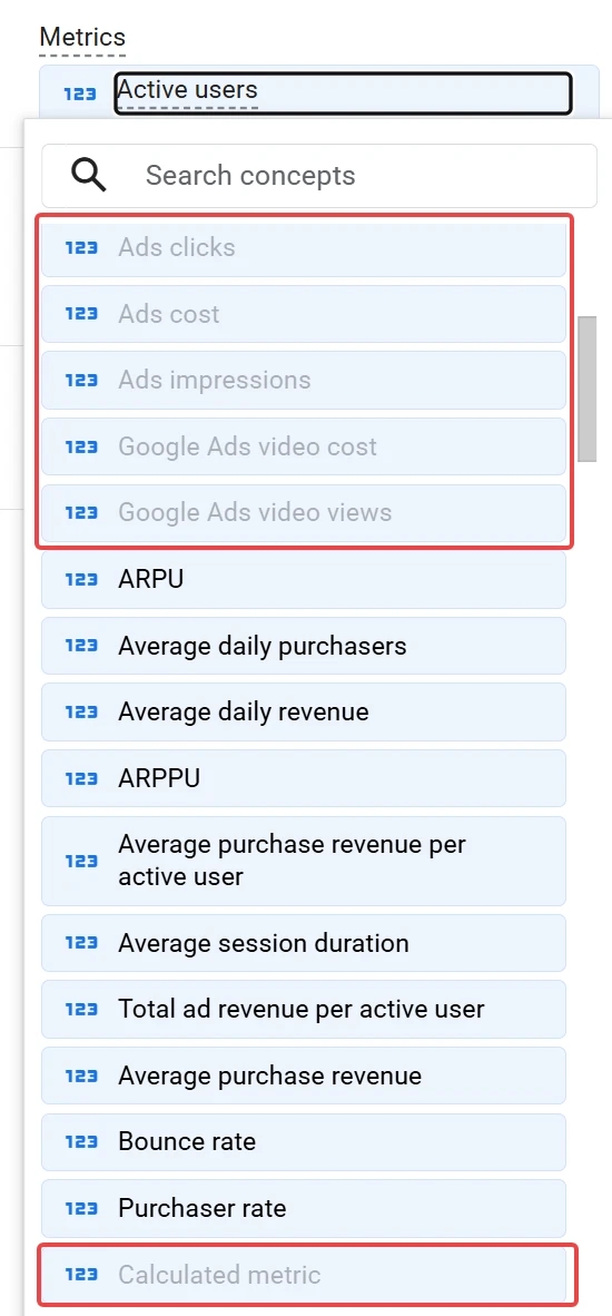
- As you may have noticed in the screenshot above, calculated metrics can’t currently be used in dashboards either.
- You'll need Editor or Administrator permissions to create and publish dashboards. However, anyone with access to the property can view published dashboards.
- Standard properties are limited to a maximum of 15 cards per dashboard (a "card" here means an individual visual element on the dashboard); for premium properties, the limit is doubled, to 30 cards.
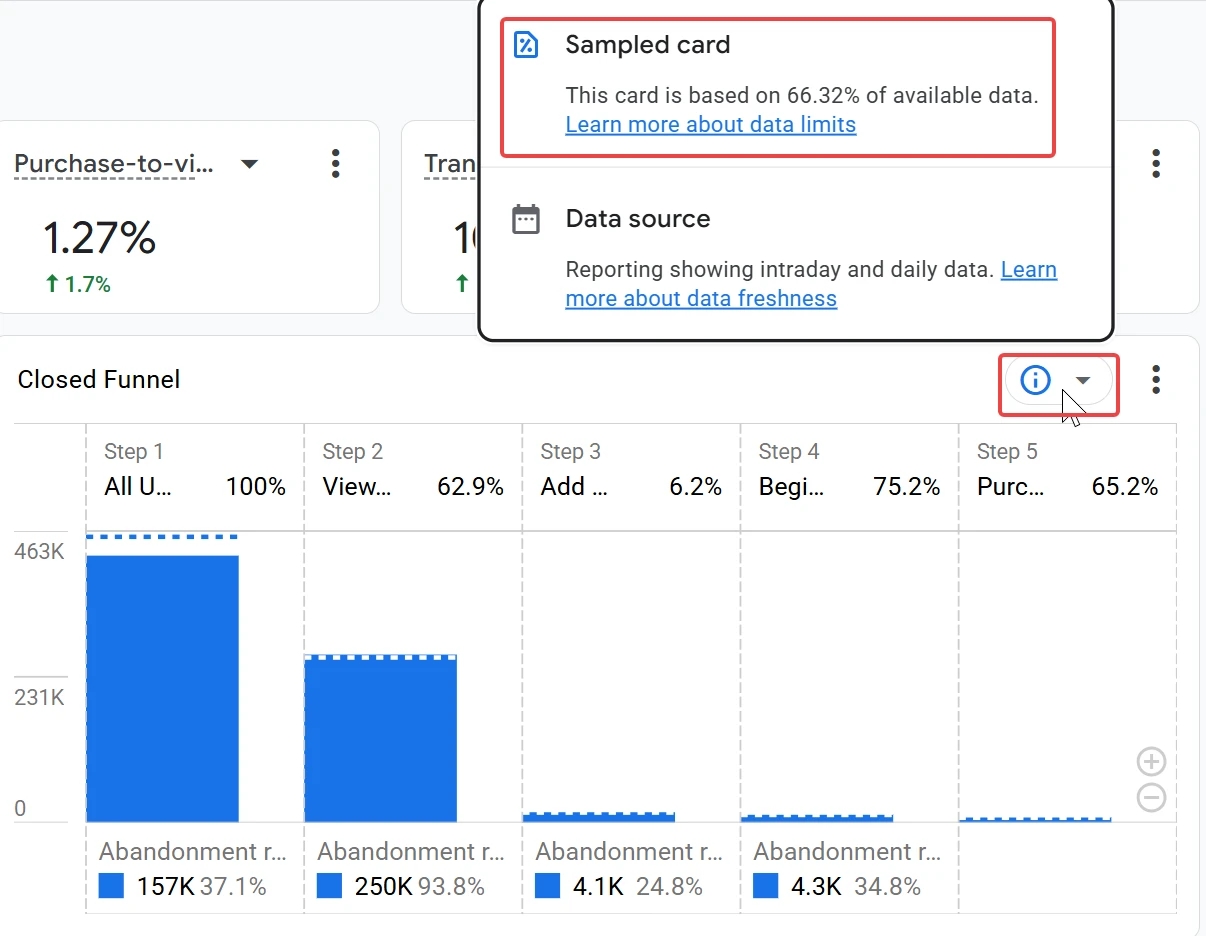
- If the data on a card is incomplete or limited, you'll notice a blue circle with an "i," which you can hover over to see details about the limitation:
- There's currently no support for the API or for segments at the card level.
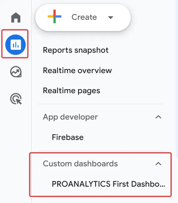
- Make sure to select a collection the first time you save a dashboard — otherwise it'll end up in the library and won't show up in the Reports section (you can, of course, add it there afterward, but that's extra work you can avoid).
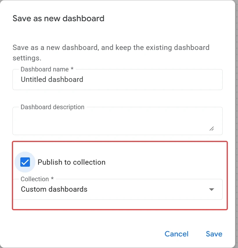
If you get it right, it will show up here right away:
A Few Closing Thoughts
In my view, this is a genuinely important update for marketing as a field. Google Analytics has always been the industry standard and a trendsetter — yes, even back when it was forcing everyone to migrate to GA4.
The arrival of dashboards in GA4, in my view, narrows the gap between two types of companies: those who believe GA4's standard reports are enough for modern marketing, and those who believe their marketing is flying blind without end-to-end analytics. A large share of people in the first camp stay there because they assume end-to-end analytics and convenient decision-making dashboards are slow, expensive, and complicated (and to be fair, that's often genuinely true). And because of that, they don't realize just how convenient it is, or what proper reporting actually makes possible. They don't realize it because they've never tried using it. And they've never tried it because it's slow, expensive, and complicated.
Of course, I'm not saying that GA4 and its dashboards will replace BI systems like Power BI, Tableau, or Looker. They operate on entirely different levels. But thanks to its sheer scale, GA4 can very easily popularize the habit of having all your decision-making data at your fingertips, on a single screen. And that's exactly what dashboards give us.
Of course, this is just the GA4 team's first attempt. Yes, there are still bugs in the functionality, as I mentioned above. Yes, there's still plenty of work to be done. But the first stone has been laid, and the direction looks like exactly the right one.
So, what are your impressions of this update?
Loading comments…