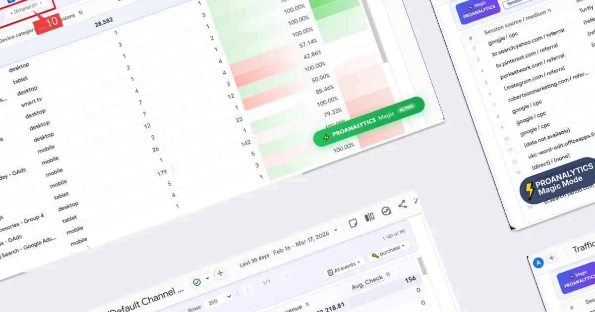
PROANALYTICS Extension Update: Convenient Date Selection and PROANALYTICS Magic Mode

When I first started building the PROANALYTICS extension, it was meant to be a simple helper for quickly highlighting CSS selectors. But, as is often the case with favorite tools, it’s hard to stop. Later, I added Google Ads functionality to it.
A lot of time has passed since the last update. Now there are two major updates: extended date management and PROANALYTICS Magic mode. Let’s take a closer look at what exactly has changed.
- Quick date selection and comparison mode
- PROANALYTICS Magic Mode
- Add up to 10 parameters to the report
- Improved comparison visualization
- Sort by delta (Δ%)
- Select key events for all metrics at once
- Hide zero values in the report
- Add custom columns with calculations
- Easily reorder columns
- Change metrics visualization
- Hide unnecessary columns in one click
- Create report presets
- Reset custom report settings in one click
- Up to 5,000 rows in the report instead of the standard 250
- Change font size in the report
Quick date selection and comparison mode
One of the most common actions in GA4 is switching between periods and enabling comparison. At the same time, this process looks quite overloaded, so I decided to simplify it down to literally one click.
Date selection on the panel
- At the top of the interface, you will see a panel with ready-made period options — Today, Yesterday, Last 7 days, Last 30 days. These are the most commonly used scenarios, so now you don’t need to manually select them through the calendar every time.
- On the right side of the panel, there is also a button to activate comparison mode. When clicked, it automatically selects the comparison period.
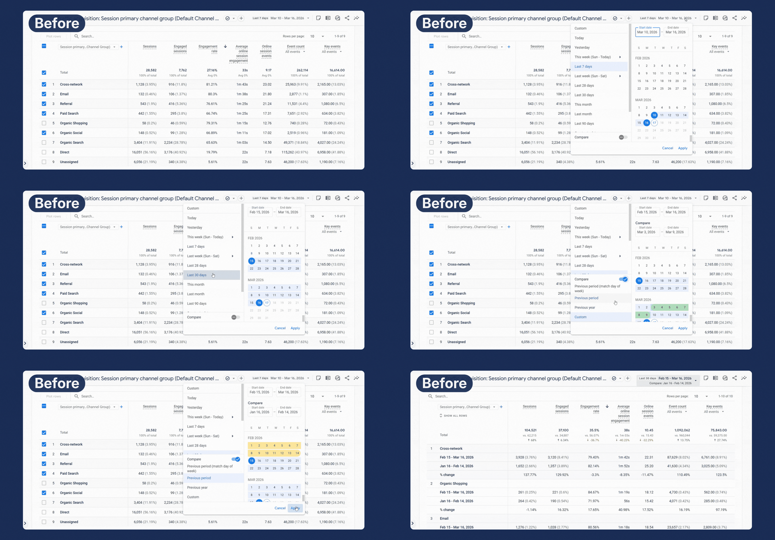
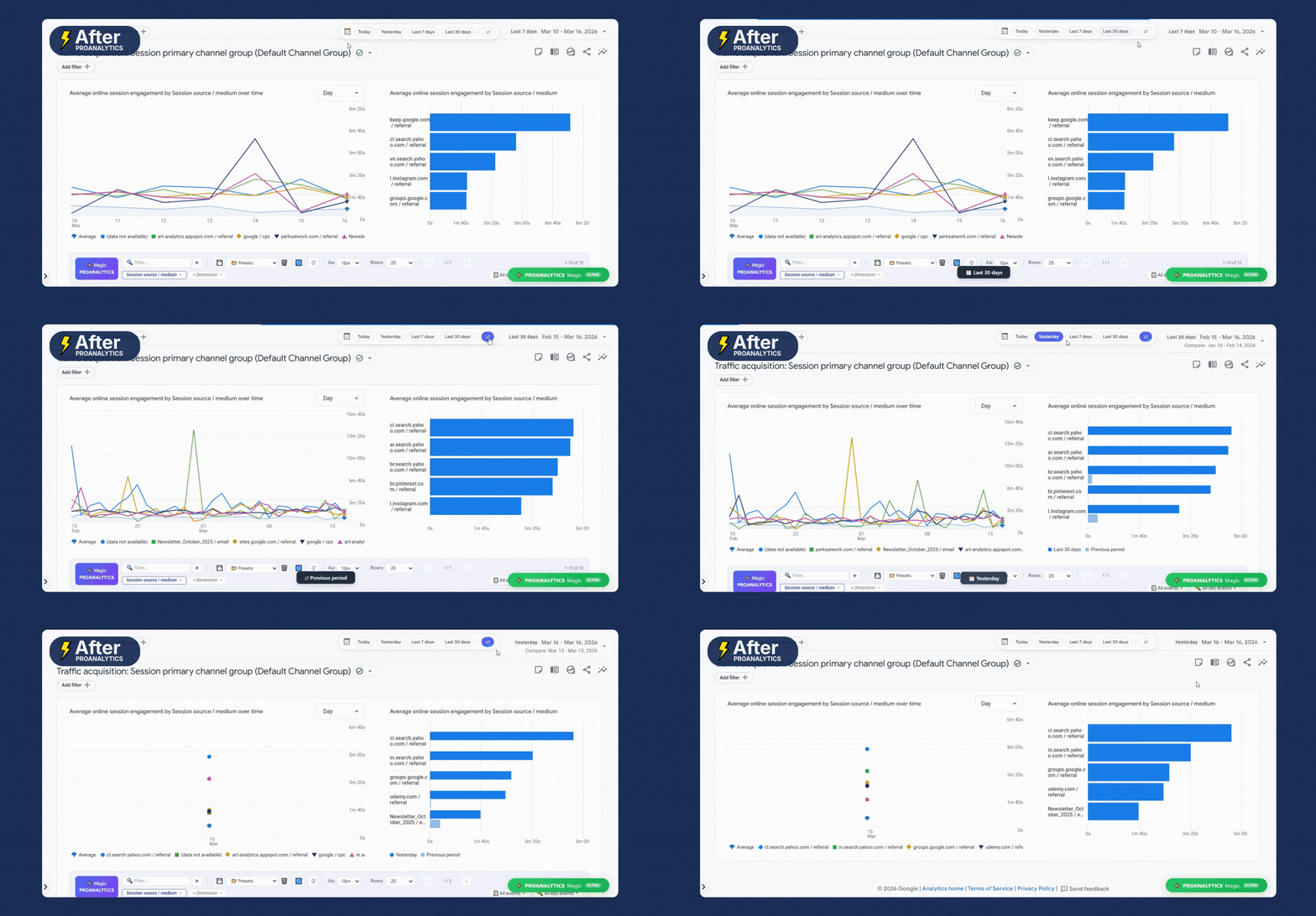
The logic of period comparison is simple: the comparison is always made with the equivalent previous period.
For example, if you select the last 7 days — the data will be compared with the previous 7 days. If it’s 30 days — accordingly, with the previous 30-day period. In the case of a single day, everything works the same way: the selected value is compared with the previous day. That is, if you are viewing today’s data — the comparison will be with yesterday, and if a specific date is selected — with the day before it.
You can move the panel around the screen. It remembers its position, so you can easily adjust it to your needs and avoid covering important parts of the interface.
Date selection using shortcuts
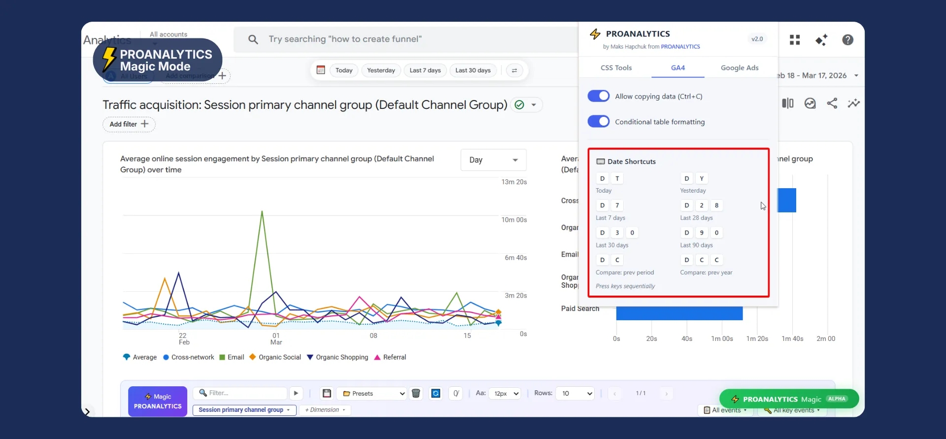
And if you, like me, prefer hotkeys — now switching periods and comparison mode doesn’t require using the mouse at all.
In the main extension window, in the GA4 block, a separate section called Date shortcuts has appeared, where you can see which key combinations correspond to period selection.
PROANALYTICS Magic Mode
PROANALYTICS Magic Mode is the biggest part of the latest update. And it really does add some magic.
All the new analytics functionality is activated with a single button — PROANALYTICS Magic. Before you click it, the interface remains standard, but after — the report is fully transformed for convenient analysis.
You can move the button around the screen. It remembers its position, so you can easily adjust it to your needs and avoid covering important parts of the interface.
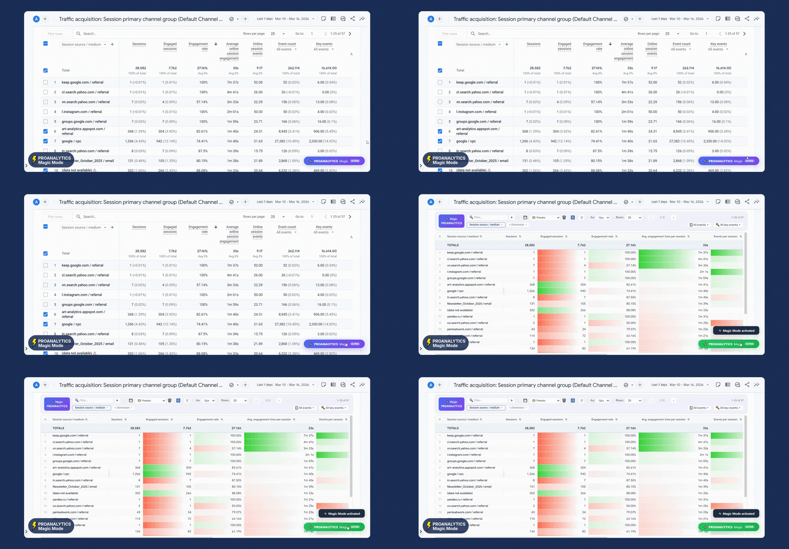
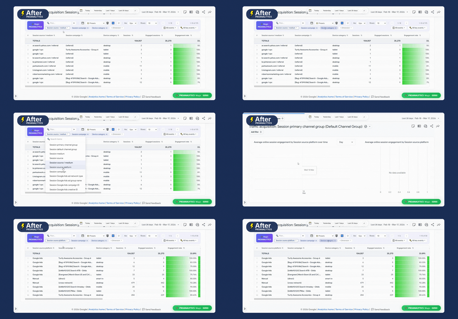
Add up to 10 parameters to the report
Standard GA4 limits us to only two parameters in a table. In “magic” mode, these limits disappear:
- You can add up to 10 additional parameters at once to get максимально detailed data.
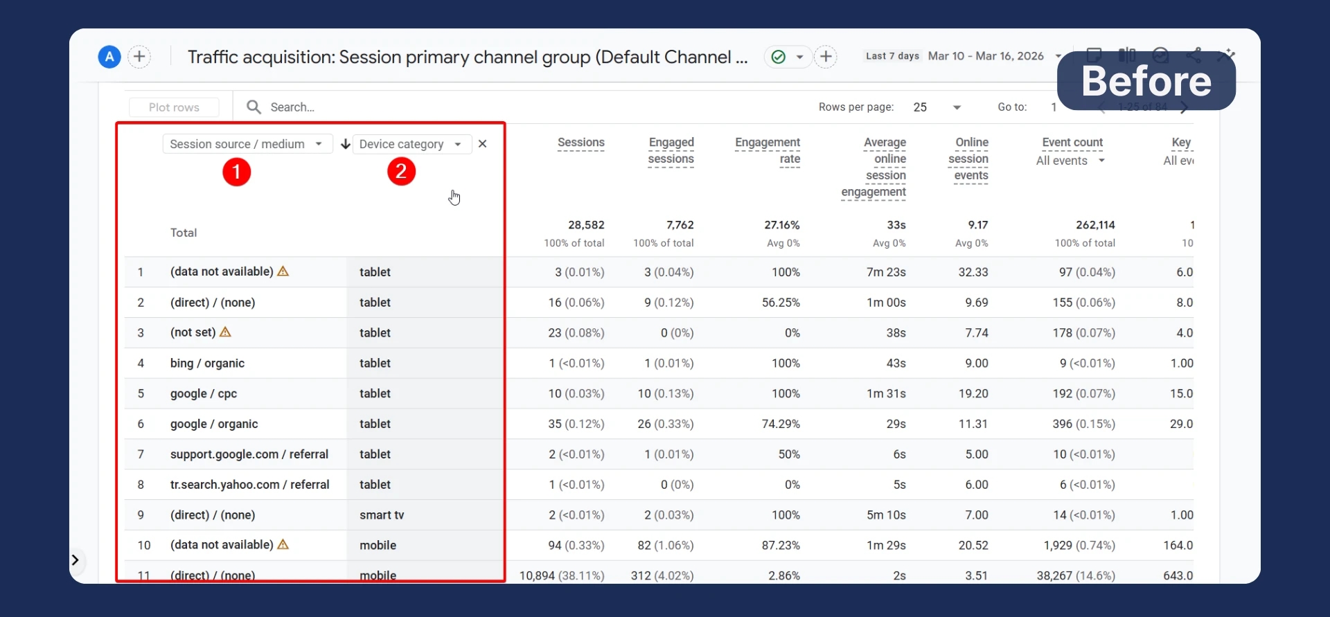
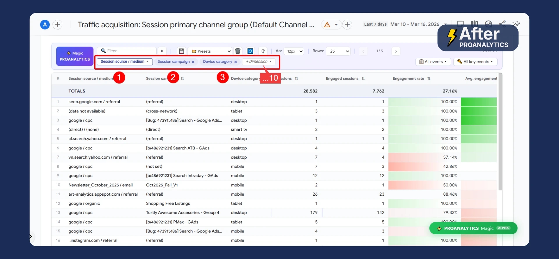
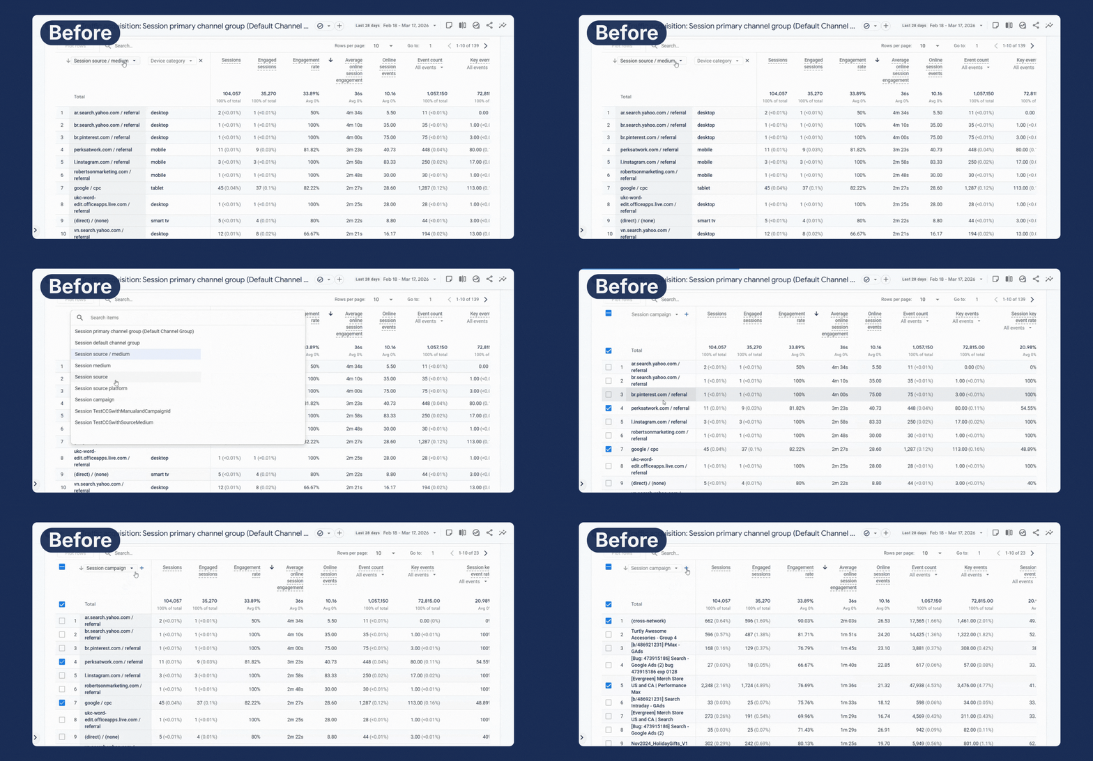
- Smart memory: in standard mode, changing one parameter resets another. In PROANALYTICS Magic, when you make changes, everything stays in place — you don’t need to select them again.
Improved comparison visualization
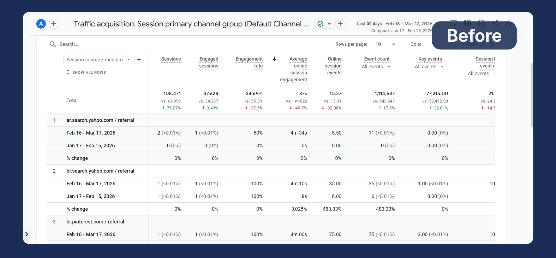
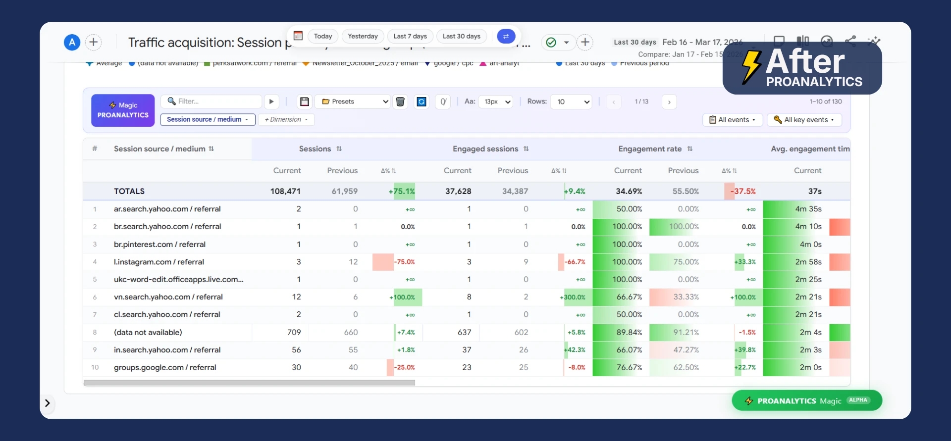
This is one of those cases where it’s better to see it once than to read about it for a long time.
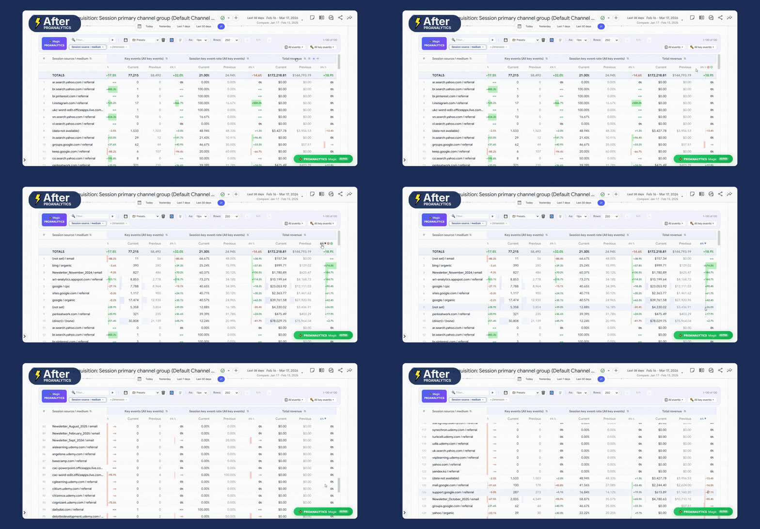
Sort by delta (Δ%)
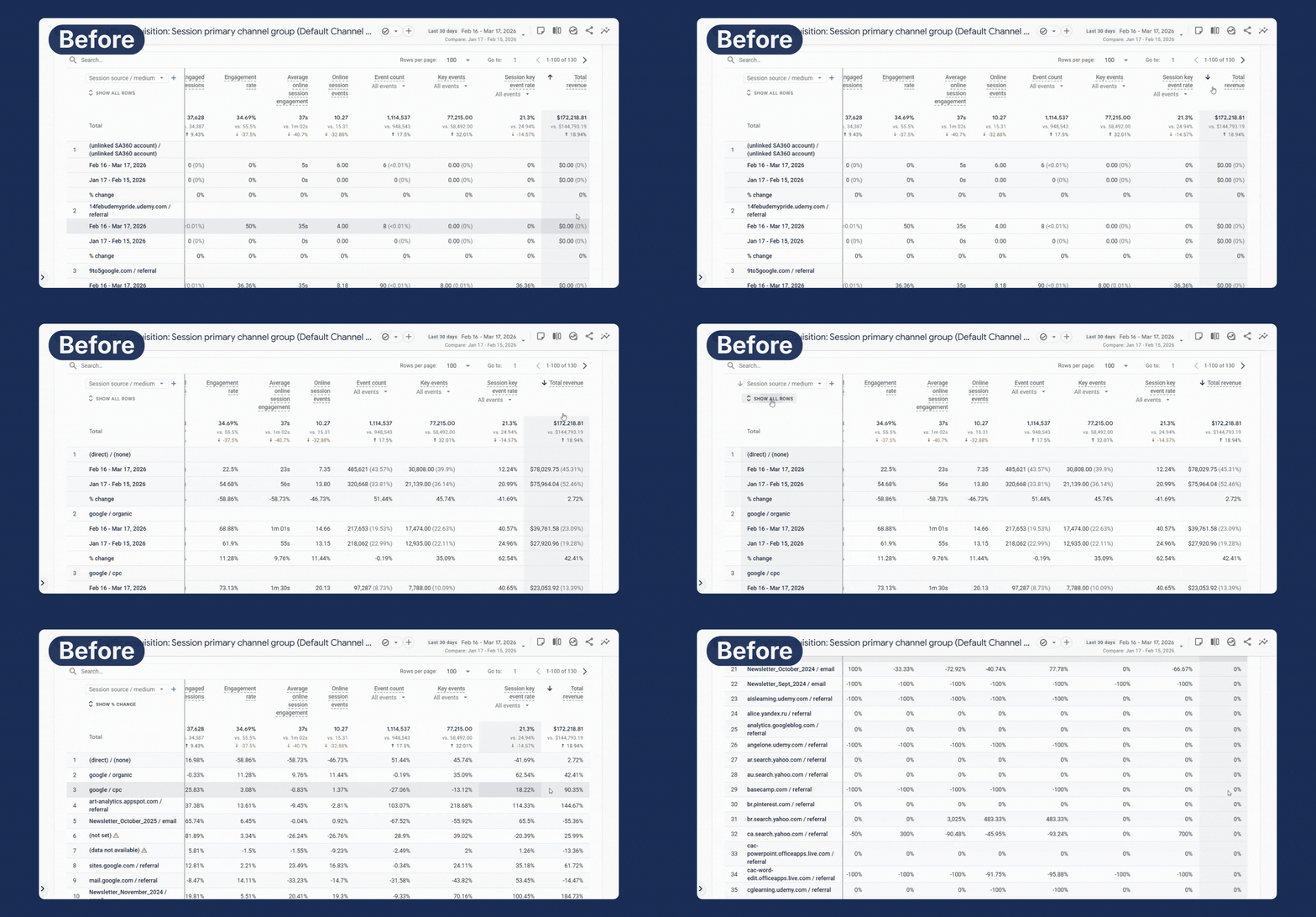
Another inconvenience when working with reports is limited sorting. When analyzing data, we usually want to see not just “who generated the most/least revenue,” but what started working better, what got worse, and what needs attention.
For example, I want to understand during period comparison which traffic sources had the biggest increase in Revenue or, on the contrary, where we experienced a significant drop. In the standard GA4 interface, this is impossible because sorting only works by absolute numbers for the current period. Even if you enable comparison mode and see the percentage change, the system still doesn’t allow you to sort the table by this “delta.”
In PROANALYTICS Magic mode, this is fixed. Now, next to each metric, there is a special button for sorting by delta — Δ%.
Select key events for all metrics at once
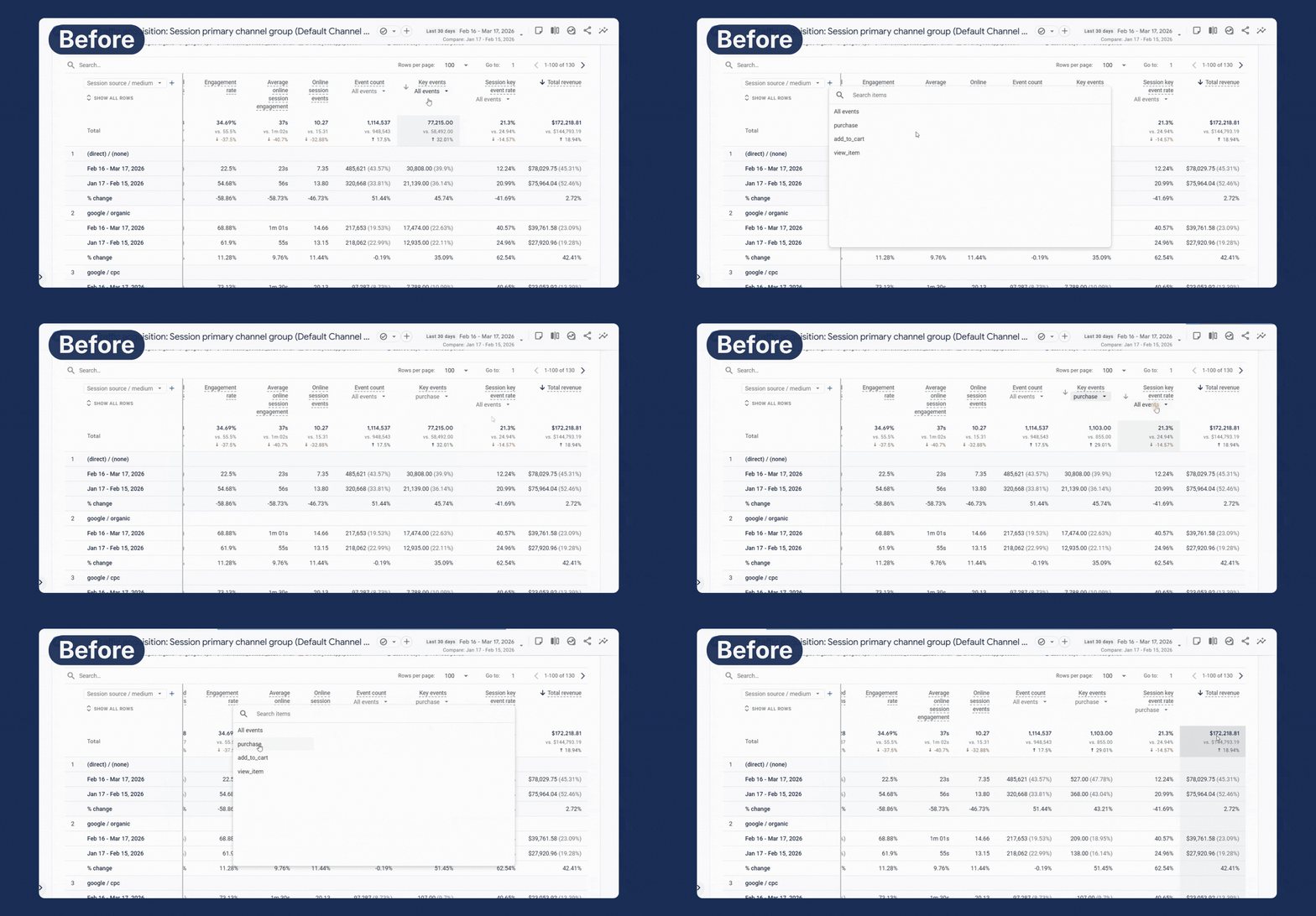
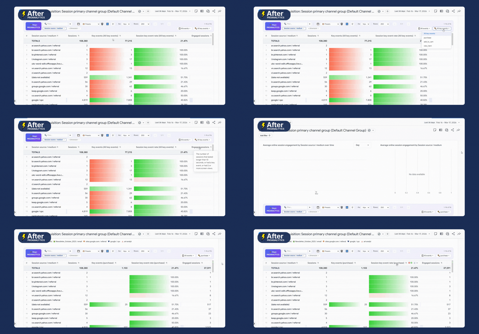
When working with metrics related to key events — for example, Key event rate or Session key event rate — to view data for a specific event, you need to select it separately for each metric. In other words, you end up repeating the same action multiple times.
In PROANALYTICS Magic mode, it’s enough to select a key event once — and it is automatically applied to all relevant metrics in the table.
Hide zero values in the report
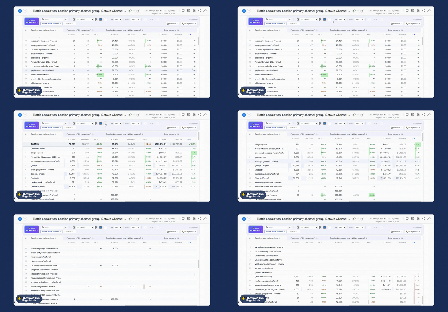
We often work with large tables and a lot of data, a big part of which may show zero results. This data brings no value for analysis but forces you to endlessly scroll the page in search of real activity.
In Magic mode, you can instantly hide these “empty” rows.
Add custom columns with calculations
There are situations when you need to quickly calculate something based on existing data directly in the report. In GA4, this cannot be done directly in the report.
A classic example is funnel analysis — in the standard interface, the table lacks percentage transitions between steps. For example, when we look at events like View item and Add to cart, it would be logical to immediately see what percentage of users move from viewing a product to adding it to the cart. But in standard GA4, this metric does not exist.
In PROANALYTICS Magic mode, this problem is solved. You can create your own columns directly in the table — with the required calculation logic.
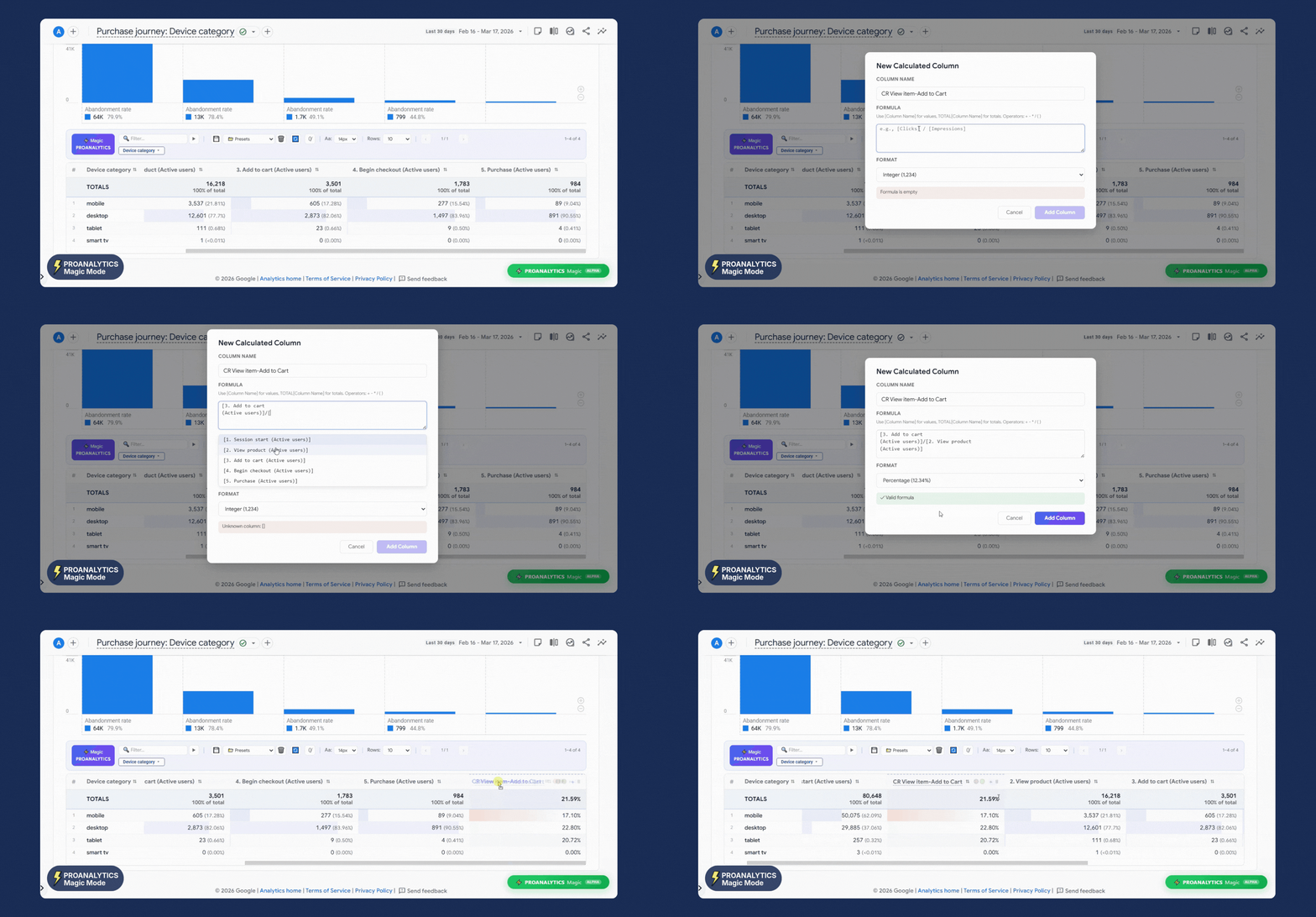
Another example of using this feature is calculating the average order value (AOV).
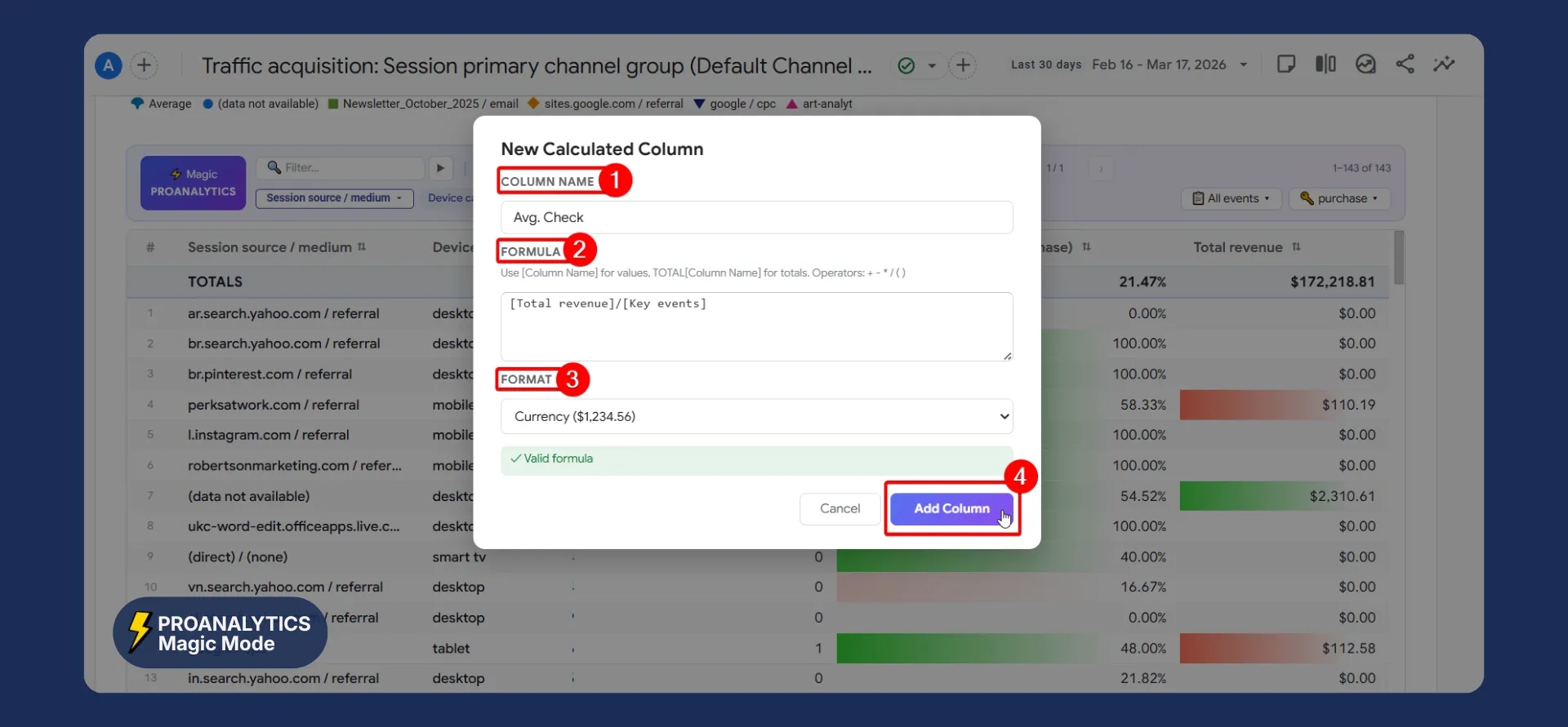
In standard GA4 reports, you see total revenue and the number of transactions separately. To understand where users spend more per order, we can quickly calculate this metric directly in the interface. The process is the same:
- Click the “+” next to any metric.
- Enter the formula: for average order value, divide Total revenue by the number of purchase events.
- Give it a name.
- Select the value format.
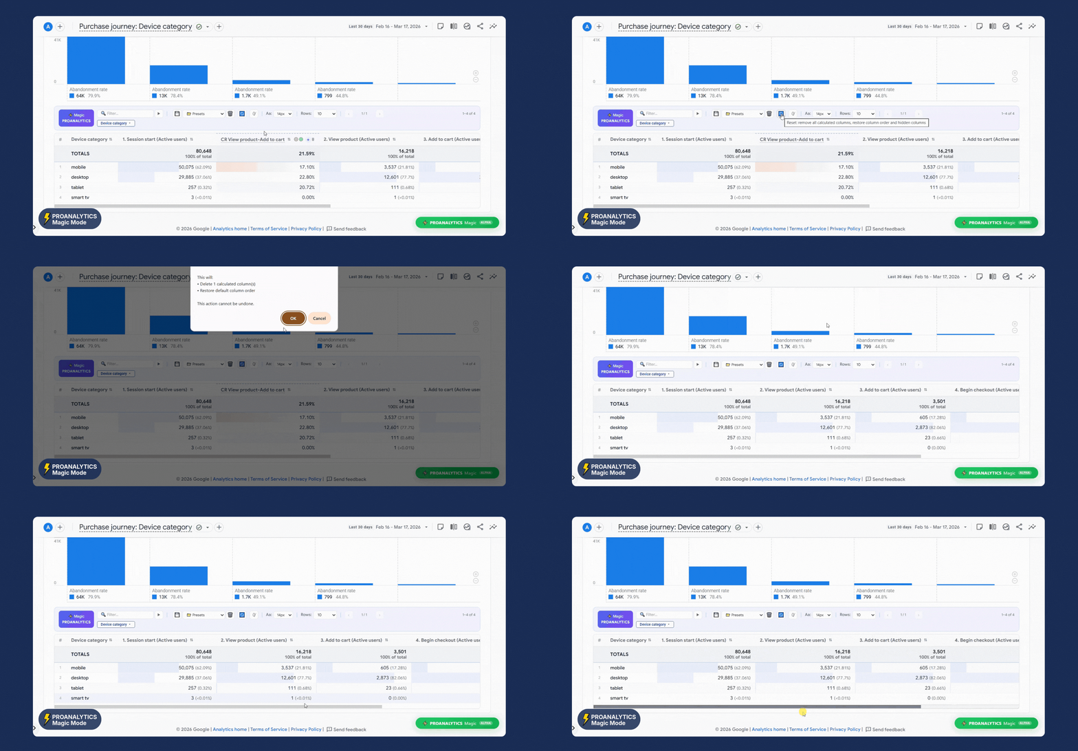
Note: custom columns have “smart memory.”
Once you create a column, it is saved in your workspace. Even if you switch to another report and then come back — your custom columns will remain in place.
You can delete them using the corresponding command. To do this, click the “Reset” button.
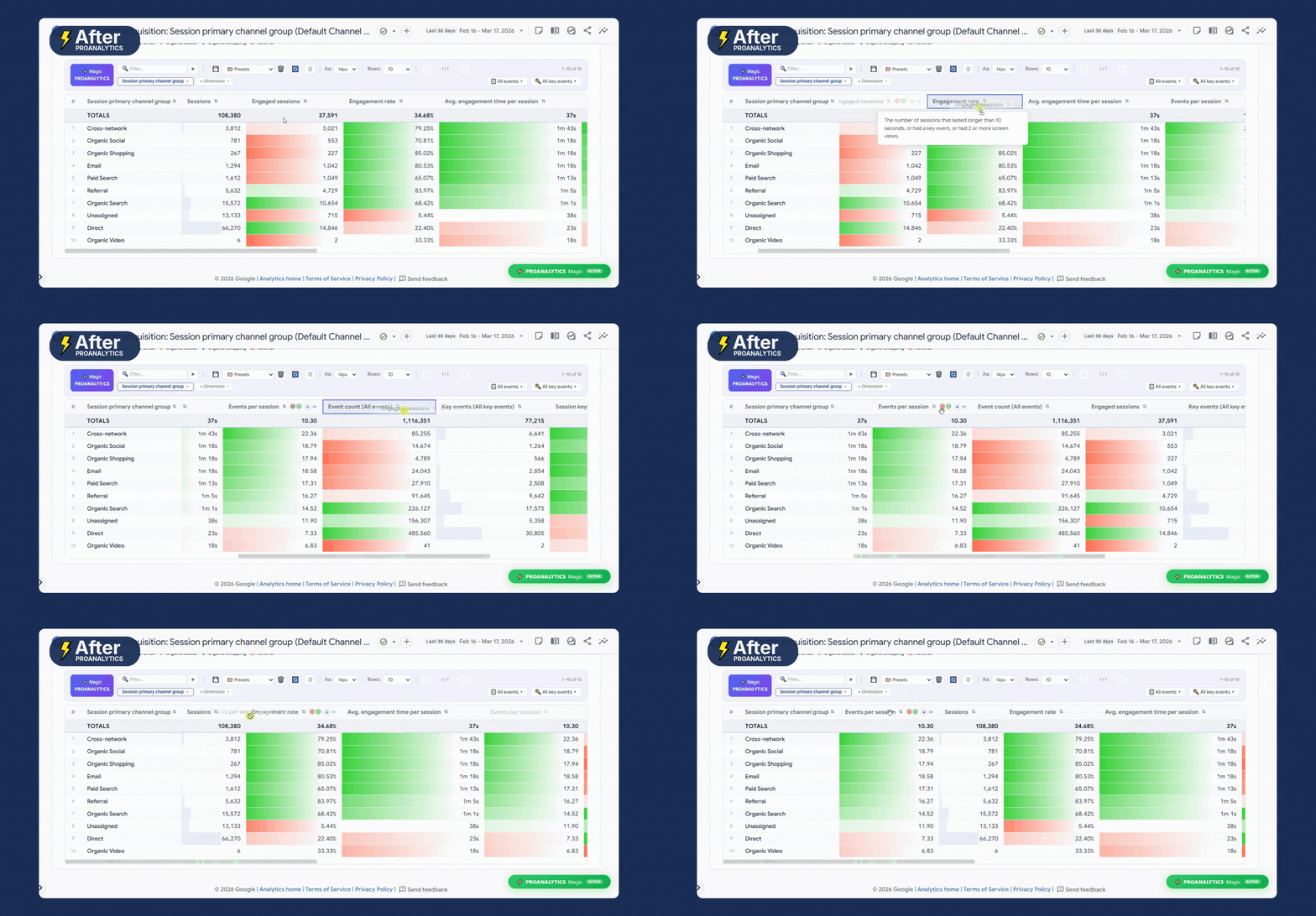
Easily reorder columns
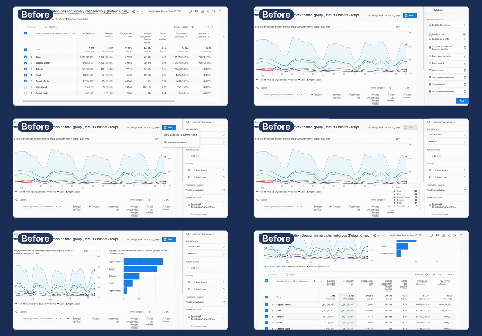
To move a column to a different position in GA4, you normally have to perform many actions, but with the extension, you just need to click and hold the metric name and drag it to a new position.
Change metrics visualization
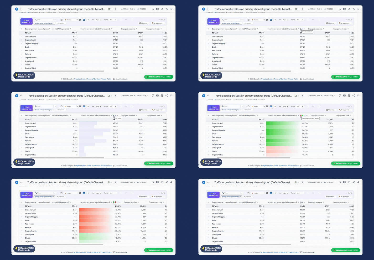
When reports contain hundreds of metrics, your eyes start to blur. In Magic mode, you can transform dry tables into a clear visual map of data. You can choose:
- Bar charts: you immediately see the share of each row relative to the total, without reading the numbers.
- Color scales: cells are highlighted with a gradient from red to green depending on deviation from the average value.
Color logic: you can change the “More is better” rule.
- “More is better” mode: high values are green, and low values are red. Relevant, for example, for average order value.
- “Less is better” mode (inverted): low values are green, and high values are red. Relevant, for example, for CPL.
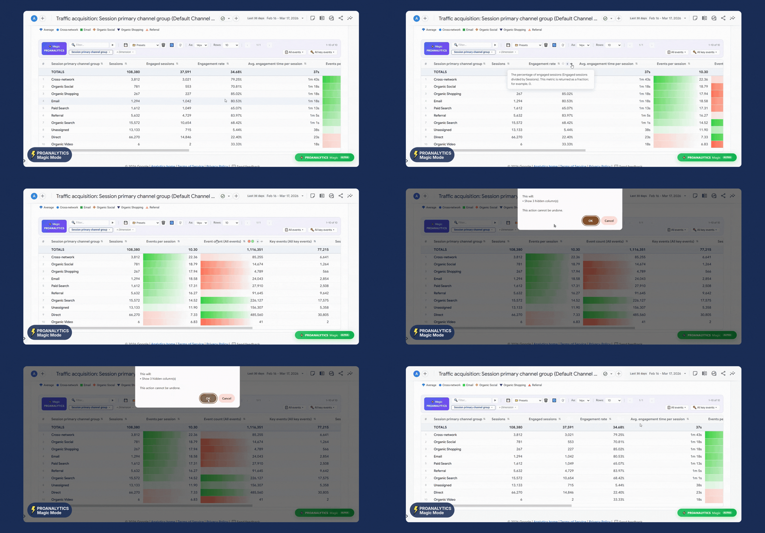
Hide unnecessary columns in one click
If a column gets in your way, you can now instantly hide it by clicking the eye icon.
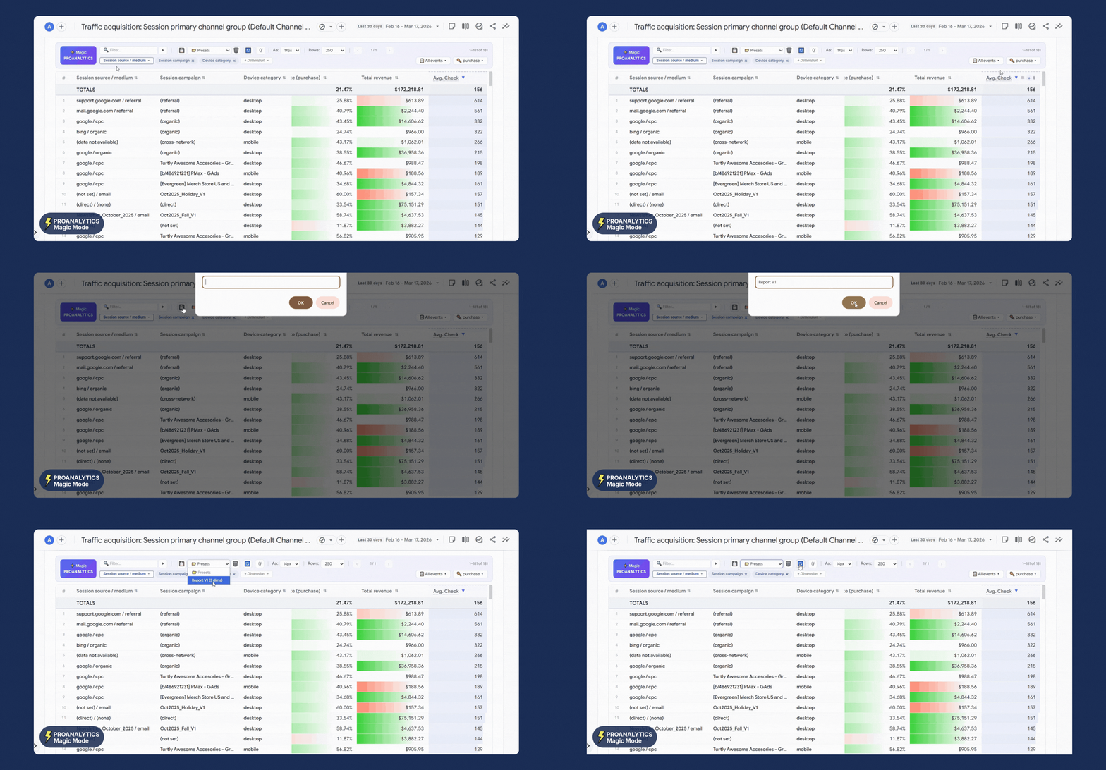
Create report presets
When you’ve spent time setting up a report perfectly — added all the necessary parameters, calculated your own metrics using custom columns, and configured the visualization — the last thing you want is to repeat these steps next time.
That’s why Magic mode allows you to create presets. A preset is a way to save all report settings exactly as you want them.
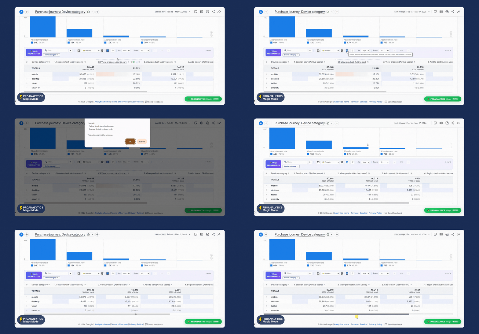
Reset all custom report settings in one click
If you need to return the report to its default state — whether it’s removing additional columns, restoring column order, or anything else — just click the Reset button.
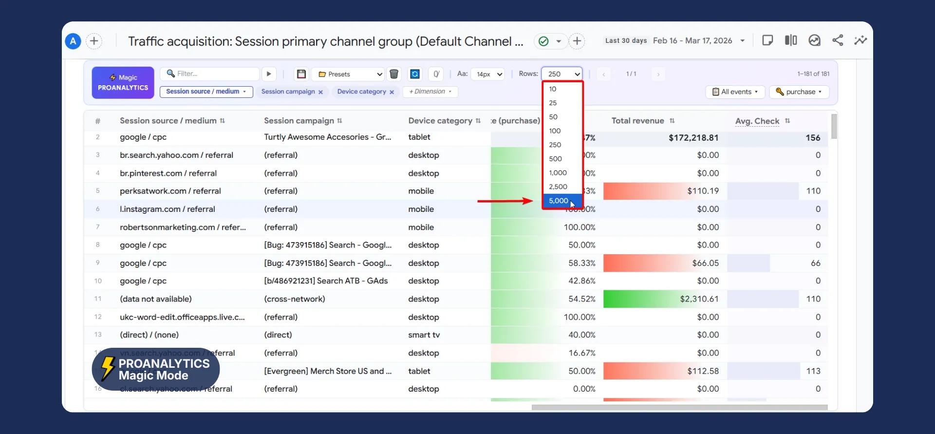
Up to 5,000 rows in the report instead of the standard 250
In the standard interface, you can view a maximum of 250 rows. With the extension, you can analyze up to 5,000 rows at once. This allows you to see the full picture of the data without constantly switching between report pages.
Please note that working with this number of rows significantly impacts your computer’s resources. I recommend loading more than 1,000 rows only if you have a sufficiently powerful PC to avoid browser slowdowns.
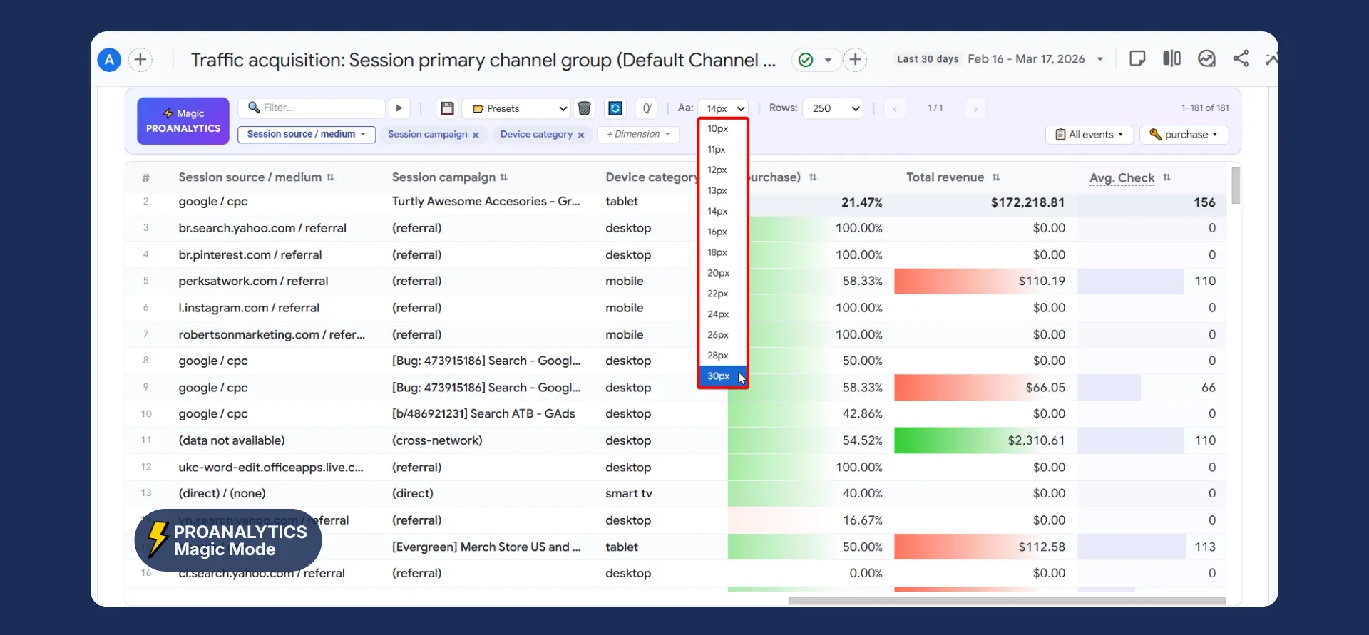
Change font size in the report
It often happens that the default GA4 font is too small for comfortable work. Especially when you need to take a screenshot of a table for a client or insert data into a presentation. In Magic mode, you can change the font size directly from the report control panel.
That’s all for today. See you.
And almost forgot — you can install the PROANALYTICS extension via the link.
Let me know in the comments which of the new features is the most useful for you.
Loading comments…